vue-svg-map


A set of Vue.js components to display an interactive SVG map.
Demo
Installation
npm
npm install --save vue-svg-map
yarn
yarn add vue-svg-map
Usage
Install the map you need from svg-maps or use your own map. See maps section for more details.
🌍 Simple SVG Map
This is the base component to display an SVG map.
In a SFC (Single File Component):
- Import
SvgMapcomponent fromvue-svg-map - Import the map you want
- Optionally, import
vue-svg-map/dist/index.cssif you want to apply the default styles
<template> <svg-map :map="Taiwan" /></template> <script>import { SvgMap } from "vue-svg-map";import Taiwan from "@svg-maps/taiwan"; export default { name: "MyMap", components: { SvgMap }, data() { return { Taiwan }; }};</script> <style src="vue-svg-map/dist/index.css"></style>Props
| Prop | Type | Default | Description |
|---|---|---|---|
| map | Object | required | Describe SVG map to display. See maps section for more details. |
| location-class | String|Function | null |
CSS class of each <path>. The function parameters are the location object and the location index. |
| location-tabindex | String|Function | null |
Tabindex each <path>. The function parameters are the location object and the location index. |
| location-role | String | null |
ARIA role of each <path>. |
| is-location-selected | Function | null |
Executed to determine if a location is selected. This property is used to set the aria-checked HTML attribute. |
Events
All the listeners (click, keypress...) are applied to each location.
Slots
There are 2 named slots:
beforewhich is before the locationsafterwhich is after the locations
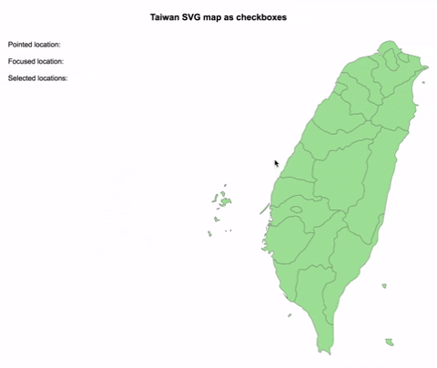
☑️ Checkbox SVG Map
This is an implementation of SvgMap that behaves like a group of checkboxes.
It is based on this WAI-ARIA example to support keyboard navigation and be accessible.
- Import
CheckboxSvgMapcomponent fromvue-svg-map - Import the map you want
- Optionally, import
vue-svg-map/dist/index.cssif you want to apply the default styles
<template> <checkbox-svg-map v-model="selectedLocations" :map="Taiwan" /></template> <script>import { CheckboxSvgMap } from "vue-svg-map";import Taiwan from "@svg-maps/taiwan"; export default { name: "MyCheckboxMap", components: { CheckboxSvgMap }, data() { return { Taiwan, selectedLocations: [] }; }};</script> <style src="vue-svg-map/dist/index.css"></style>Props
| Prop | Type | Default | Description |
|---|---|---|---|
| map | Object | required | Describe SVG map to display. See maps section for more details. |
| value | String[] | [] |
List of ids of selected locations. Used for v-model. |
| location-class | String|Function | null |
CSS class of each <path>. The function parameters are the location object and the location index. |
Events
Like for SvgMap all the listeners (click, keypress...) are applied to each location.
| Event | Output | Description |
|---|---|---|
| change | String[] | Emits the new list of ids when a location is selected/unselected. Used for v-model. |
Slots
Like in SvgMap there are 2 named slots:
beforewhich is before the locationsafterwhich is after the locations
Note: inserting focusable elements may break the checkboxes' behaviour.
🔘 Radio SVG Map
This is an implementation of SvgMap that behaves like a group of radio buttons.
It is based on this WAI-ARIA example to support keyboard navigation and be accessible.
- Import
RadioSvgMapcomponent fromvue-svg-map - Import the map you want
- Optionally, import
vue-svg-map/dist/index.cssif you want to apply the default styles
<template> <radio-svg-map v-model="selectedLocation" :map="Taiwan" /></template> <script>import { RadioSvgMap } from "vue-svg-map";import Taiwan from "@svg-maps/taiwan"; export default { name: "MyRadioMap", components: { RadioSvgMap }, data() { return { Taiwan, selectedLocation: null }; }};</script> <style src="vue-svg-map/dist/index.css"></style>Props
| Prop | Type | Default | Description |
|---|---|---|---|
| map | Object | required | Describe SVG map to display. See maps section for more details. |
| value | String | null |
Id of selected location. Used for v-model. |
| location-class | String|Function | null |
CSS class of each <path>. The function parameters are the location object and the location index. |
Events
Like for SvgMap all the listeners (click, keypress...) are applied to each location.
| Event | Output | Description |
|---|---|---|
| change | String | Emits the new id when a location is selected. Used for v-model. |
Slots
Like in SvgMap there are 2 named slots:
beforewhich is before the locationsafterwhich is after the locations
Note: inserting focusable elements may break the radio buttons' behaviour.
Maps
Existing maps
All the existing maps are in an independant svg-maps project because they may be useful for other components/projects.
Custom maps
You can modify existing maps or create your own.
Modify a map
- Import the map to modify
- Create a new object from this map
- Pass this new object as
mapprop of the component
<template> <svg-map :map="customTaiwan" /></template> <script>import { SvgMap } from "vue-svg-map";import Taiwan from "@svg-maps/taiwan"; export default { name: "MyMap", components: { SvgMap }, data() { return { customTaiwan: { ...Taiwan, label: "Custom map label", locations: Taiwan.locations.map(location => { // Modify each location to customize/add attributes of <path> }) } }; }};</script>It is recommended to not modify the SVG properties (viewBox, path), because it may break the map's display.
Create a map
If you create a new map (other country, city...), feel free to contribute to svg-maps project!
License
MIT