
Ring Chart
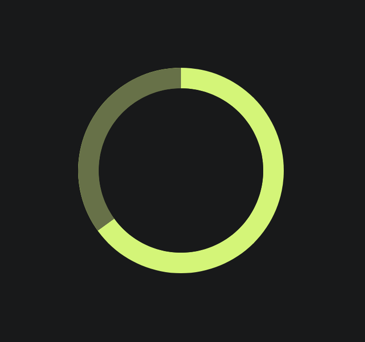
Simple Ring-Chart/Pie-Chart angular component with 1 or more sections (see demo)
Getting started
Install
NPM
npm install --save st-ring-chart
YARN
yarn add st-ring-chart
Import The Ring Chart module
; @ {}See Usage At The Demo Project
API
| Input | Type | Default | Required | Description |
|---|---|---|---|---|
| [sections] | RingSectionItem[] |
[] |
Yes | represents the chart sections, every section is in the form of: {"color": string, "percentage": number}. Sum of section percentages must be equal to 1 |
| [thickness] | number (px) |
5 | No | The width of the ring. When this number is half or greater the ring diameter it fills the ring entirely and it becomes a pie. |
| [diameter] | number (px) |
0 | Yes | The Ring/Pie diameter. |
| [centerColor] | string |
background | No | The color of the ring center. It is recommended to pass this parameter in order to avoid some display artifacts where the sections intersect |
Development
Run npm start for a dev server. Navigate to http://localhost:4200/. The app will automatically reload if you change any of the source files.
Build
Run ng build to build the project. The build artifacts will be stored in the dist/ directory. Use the --prod flag for a production build.
Running unit tests
Run ng test to execute the unit tests via Karma.