This repository is an Open Source theme for RevealJS presentations. It respect the graphical theme of @SFEIR company.
You can preview it here : https://sfeir-school-theme.netlify.app/
# run
$npm install sfeir-school-themeLet's consider that the path to reveal engine is at $LIBS_PATH
Clone the repository in your project ($SFEIR_THEME_PATH)
You should have a folder web_modules/sfeir-school-theme. In this folder you should have the bundled sfeir theme (either copy the demo web_modules or build it with npm run build).
In your index.html add the following lines:
...
<head>
    ...
    <!-- SFEIR Theme includes -->
    <script type="module" src="./scripts/slides.js"></script>
    <link
        rel="stylesheet"
        type="text/css"
        href="./web_modules/sfeir-school-theme/sfeir-school-theme.css"
        id="theme" />
</head>
<body>
    <div class="reveal">
        <!-- Any section element inside of this container is displayed as a slide -->
        <div class="slides" data-type-show="prez"></div>
    </div>
</body>
...
and a basic slides.js:
import { SfeirThemeInitializer } from "../web_modules/sfeir-school-theme/sfeir-school-theme.mjs";

// One method per module
function schoolSlides() {
  return [
    "00_intro.md",
    "01_speaker.md",
    "10_chapter1.md",
    "11_layouts.md",
    "15_vertical.md",
    "20_specifics_slides.md",
    "30_code_slides.md",
    "40_helpers.md",
    "50_modes.md",
  ];
}

function formation() {
  return [
    //
    ...schoolSlides(),
  ].map((slidePath) => {
    return { path: slidePath };
  });
}

SfeirThemeInitializer.init(formation);
Enjoy!
This theme use target for RevealJS so all you can do with RevealJS is available with theme.
You can still use RevealJS API by importing Reveal object in import { Reveal } from "../web_modules/sfeir-school-theme/sfeir-school-theme.mjs";
- Specifics slides management:
- First Slide
- Speaker Slide
- Transitions Slides
- Multiples backgrounds
- Code Higlighting (sequential highlighting will come after)
- Choice of Dark code or Light code
- Choice of font
- Progess Highlithing
- Two columns layout
- Somes helpers for images
- Compatibility with feather icons
- Easyer management of restitution slides.
- Expose some custom properties corresponding to the theme.
- As it's controlled by class, it's compatible with markdown syntax or html
- Three theme mode available : institute, school or conf
Lots of trainings given by SFEIR School program are also available with the paid program SFEIR Institute (training organism of SFEIR company). The program SFEIR School has a main theme color which is green whereas SFEIR Institute has a main theme color which is blue. To use the same support for both programs, V3 makes it possible to switch easily from one theme to another.
To this end, you have two possibilities:
- Use HTML attribute
data-theme-slides; - Use URL parameter
theme.
Below are index.html and URL examples for the available themes.
<body>
    <div class="reveal">
        <div class="slides" data-theme-slides="institute">...</div>
    </div>
</body>
https://sfeir-school-theme.netlify.app/index.html?theme=institute#/
<body>
    <div class="reveal">
        <div class="slides" data-theme-slides="school">...</div>
    </div>
</body>
https://sfeir-school-theme.netlify.app/index.html?theme=school#/
<body>
    <div class="reveal">
        <div class="slides" data-theme-slides="conf">...</div>
    </div>
</body>
https://sfeir-school-theme.netlify.app/index.html?theme=conf#/
The default value is "school" mode -> Green theme.
Here is an example of first slide according to if you set mode to institute or not.


Here are the impacts of the mode :
- Change the first slide
- If you use SFEIR background (
transition-bg-sfeir-1totransition-bg-sfeir-3), the background use will be green or blue - The underline of titles in transitions slides
- The exercice slide
- The color of feather icons
- The header of tables
If you want to translate your slides, you simply have to add the extension corresponding to the translate langage : XX-slide.EN.md.
The default langage used is French, so by default a file with no extension or when you ask french slides, the engine provides you the markdown files without lang suffix.
If your asking a slide that is not available in the asked langage, the engine will provide you the "default" langage slide.
To resume, asking FR langage will serve you default markdown files.
To specify the langage you want to use, you have two options :
- define the langage in the index.html
- adding a parameter specifying the langage
<body>
    <div class="reveal">
        <div class="slides" data-lang="EN">...</div>
    </div>
</body>Simply add a query parameter in the URL data-lang with the wanted langage after.
<!-- .slide: class="first-slide" sfeir-level="1" sfeir-techno="pwa" -->

# **Welcome to SFEIR School**

## **PWA 100**
- Attribute:
sfeir-levelcould change from 1 to 3 - Attribute:
sfeir-technodisplay the technology of the SFEIR school in the badge of SFEIR school.
<!-- .slide: class="speaker-slide" -->
# Hello ! @SFEIR


<h2> Jean-François<span> Garreau</span></h2>
### CTO front
<!-- .element: class="icon-rule icon-first" -->
### @jefbinomed
<!-- .element: class="icon-twitter icon-second" -->
### fake.email@sfeir.com
<!-- .element: class="icon-mail icon-third" -->
You can also change the order of sub information (here CTO Front & @jefbinomed). You can set up to 4 sub informations : icon-first | icon-second | icon-third.
You can also change the number of badge (one -> three) first-badge | second-badge | third-badge
<!-- .slide: class="transition" -->

# Management of custom slides
You can use those class for transitions slides :
-
blue: the text underline of transition will be set to blue -
green: the text underline of transition will be set to blue -
left: the text will be left aligned -
right: the text will be right aligned -
top: the text will be stick to the top -
bottom: the text will be stick to the bottom -
bg-white/bg-blue/bg-green: the background will be in a different color -
transition-bg-sfeir-1->transition-bg-sfeir-3: different background images linked to theme mode (school or institute) -
transition-bg-green-1->transition-bg-green-6: different green backgrounds images -
transition-bg-blue-1->transition-bg-blue-3: different blue backgrounds images
<!-- .slide: class="transition blue" -->

# Transition blue
or in green
<!-- .slide: class="transition left" -->

# Transition left
-
transition rightfor right text aligned
-
transition topfor top text aligned
-
transition bottomfor bottom text aligned
Here is the list of possible backgrounds:
<!-- .slide: class="transition bg-white" -->

# Transition-
bg-white
-
bg-blue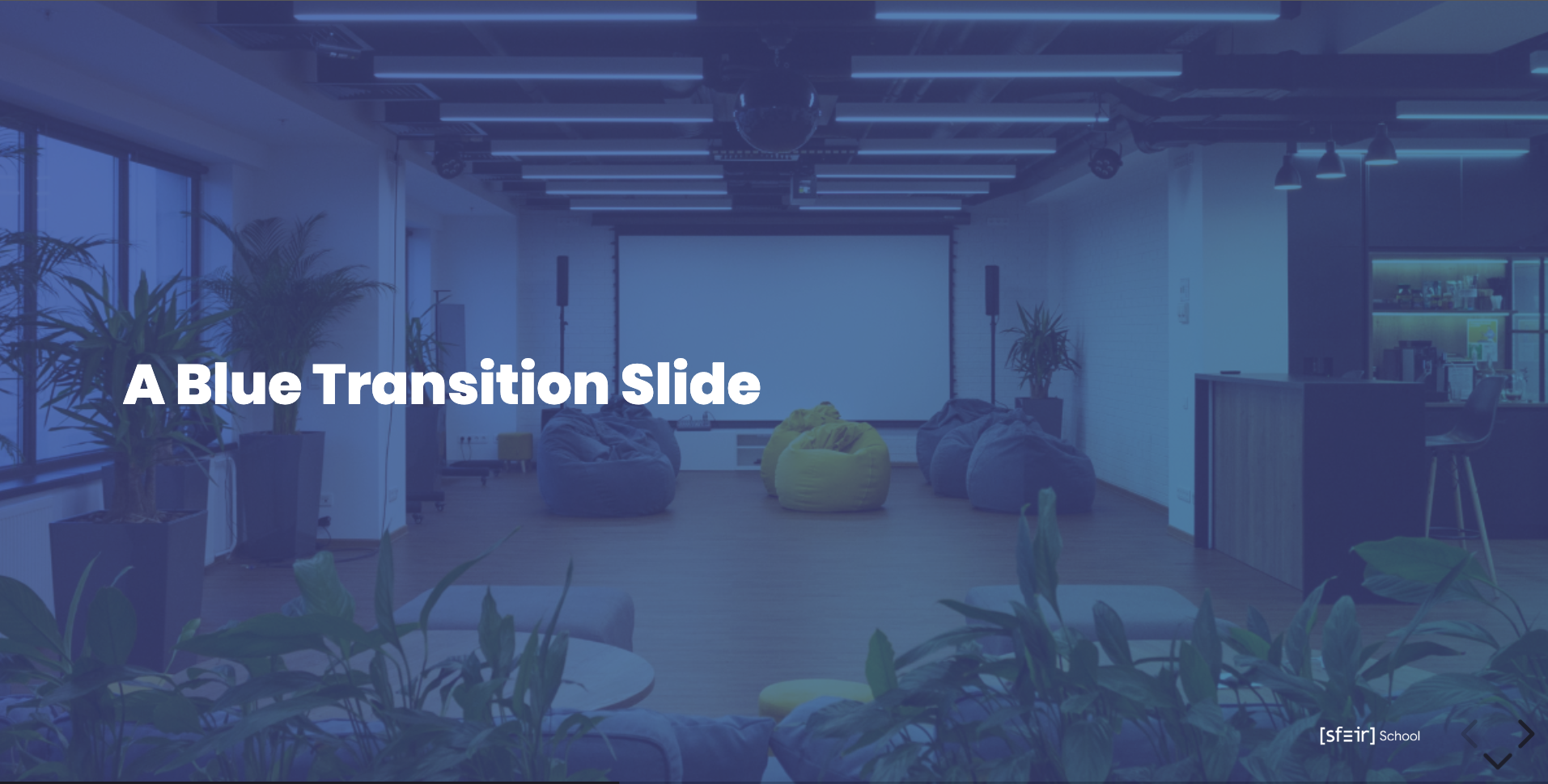
-
bg-green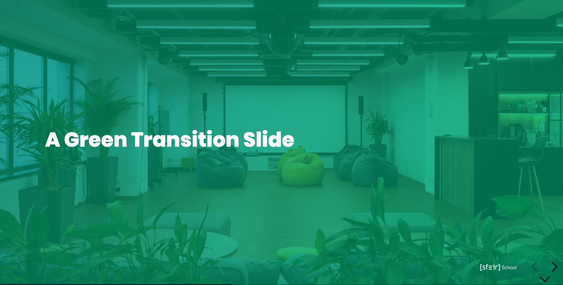


Here is the list of possible grey background
- bg-sfeir-1 = bg-green-1 or bg-blue-1
- bg-sfeir-2 = bg-green-2 or bg-blue-2
- bg-sfeir-3 = bg-green-3 or bg-blue-3
<!-- .slide: class="transition-bg-sfeir-1" -->

# SFEIR bg SFEIR 1-
transition-bg-sfeir-1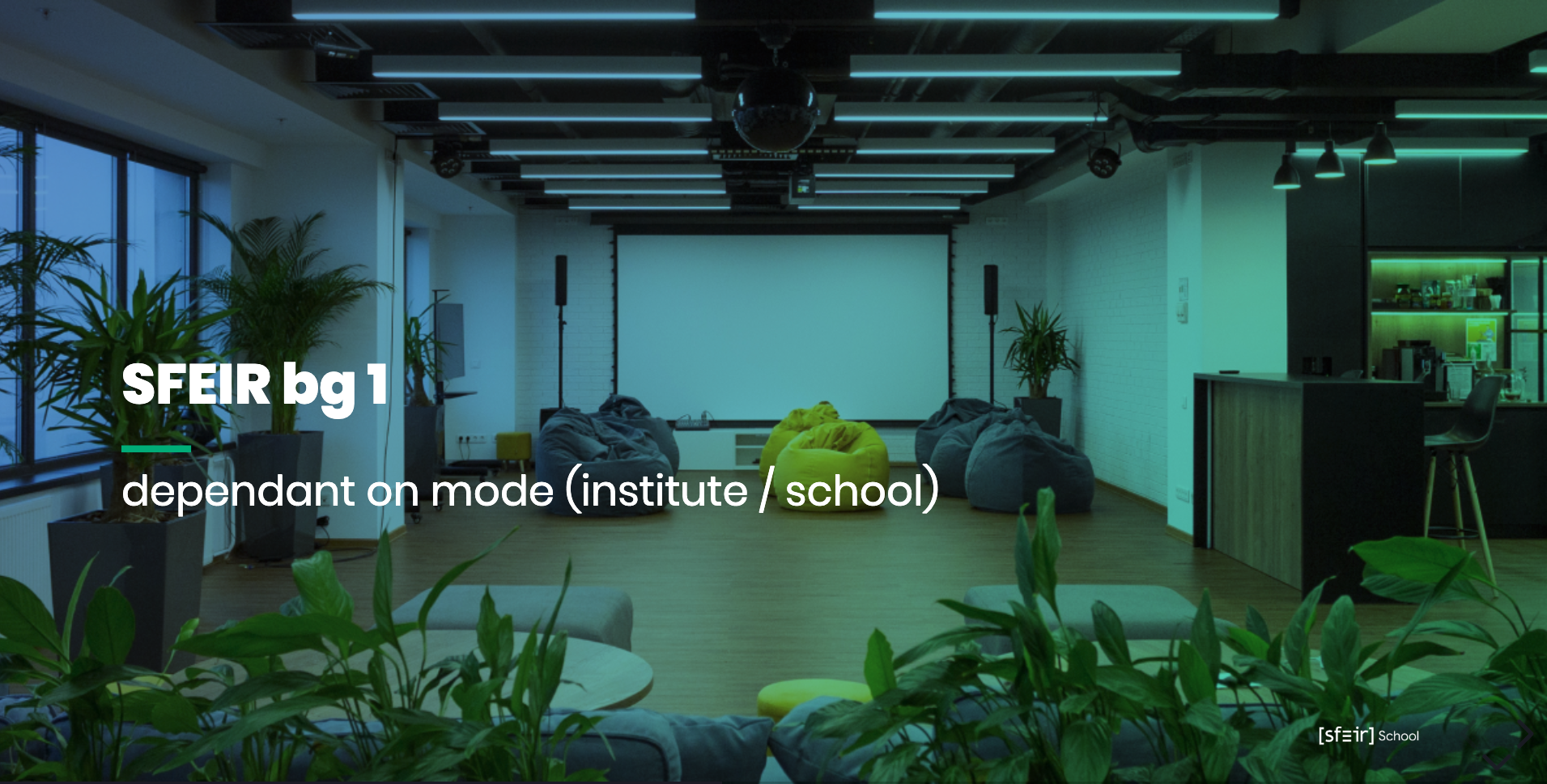
-
transition-bg-green-1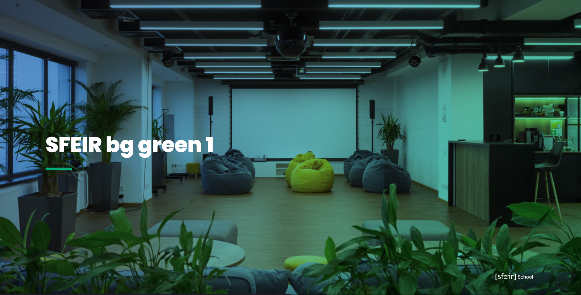
-
transition-bg-green-2
-
transition-bg-green-3
-
transition-bg-green-4
-
transition-bg-green-5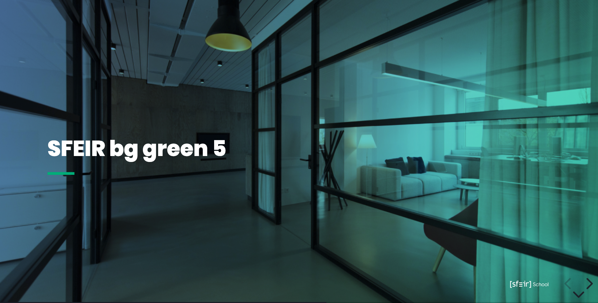
-
transition-bg-green-6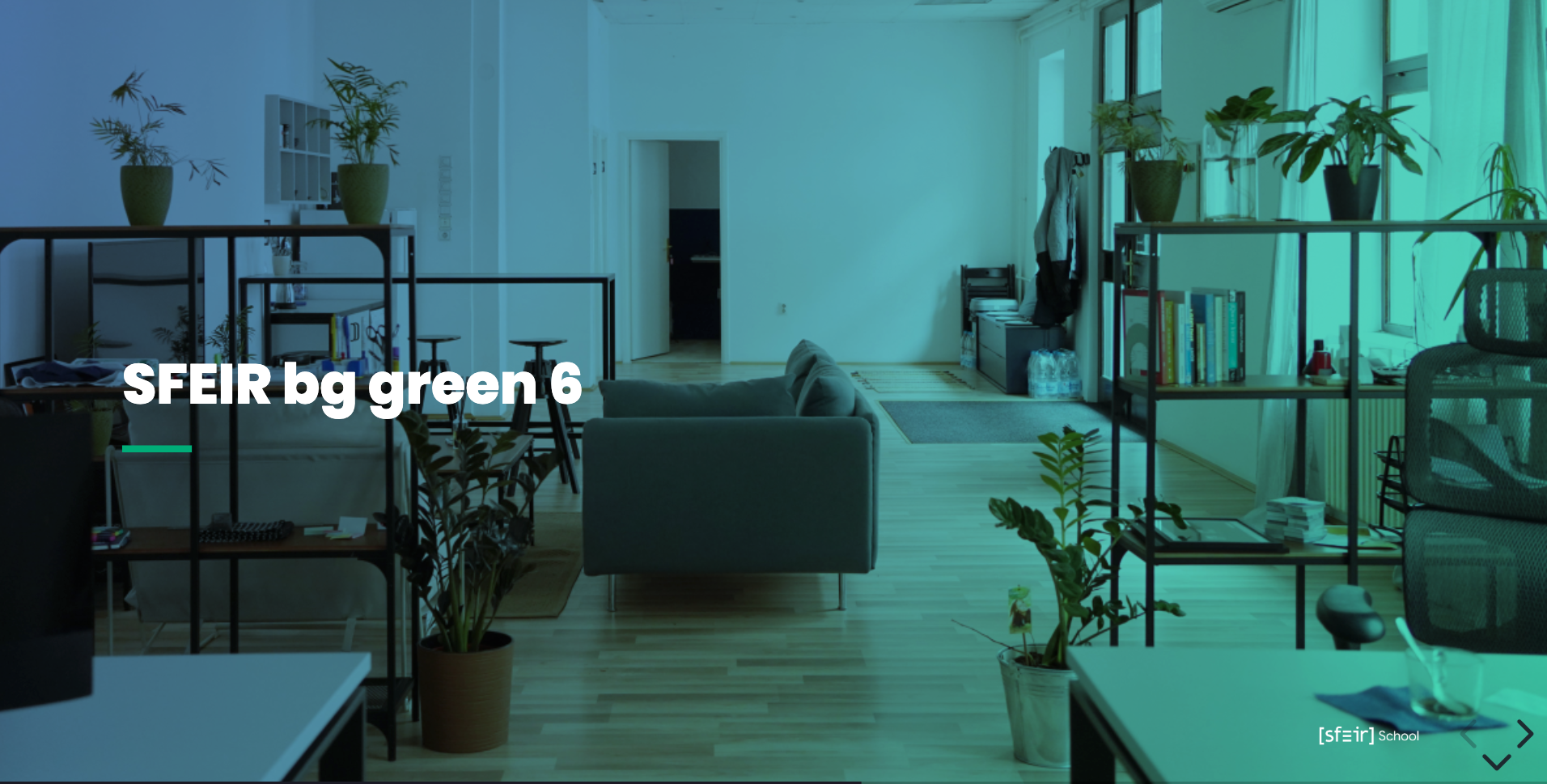
-
transition-bg-blue-1
-
transition-bg-blue-2
-
transition-bg-blue-3


<!-- .slide: data-background="./docs/images/images/dark_background.jpeg" class="transition" -->

# A Custom Transition Slide
<!-- .slide: data-background="./docs/images/images/dark_background.jpeg" class="transition mask" -->

# A Custom Transition Slide with mask
<!-- .slide: .slide: data-background="#3d4349" class="transition" -->

# Transition with bg color
You could have dedicate quote slide to display a citation
<!-- .slide: class="quote-slide" -->

## A dedicate Quote slide

<blockquote>
<cite>
  To Quote or not to quote...
</cite>
</blockquote>
There is a way to show content in a blur area for introducing pause in your training
<!-- .slide: class="bg-blur" -->
<br>
### C'est l'heure de la pause
<br>
<!-- .element: style="--icon-size:300px; --icon-color:var(--light-grey);" -->
<br>
On se retrouve à
<!-- .element: class="center" -->
<br>
<!-- .element: style="--icon-color:var(--light-grey);" --> 10h
<!-- .slide: class="two-column-layout"-->

# A Title

##--##

content left

##--##

content right
<!-- .slide: class="two-column" -->

## Slide 1

A paragraph with some text and a [link](http://hakim.se).

##--##

## Slide 2

-   Item 2
-   Item 3
<!-- .slide: class="two-column" data-background="./docs/images/images/dark_background.jpeg" -->

##--##

## Slide 2
If text is set on over the background, the default color is white

<!-- .slide: class="two-column" -->

##--##

<!-- .slide: class="text-dark" data-background="var(--black)" -->

## Slide 2

-   Item 2
-   Item 3
<!-- .slide: class="two-column" -->

##--##

<!-- .slide: class="mask" data-background="./docs/images/images/light-background.webp" -->

## Slide 2

-   Item 2
-   Item 3
Usefull when the background image has to much light

You should use triple ` sufix by the langage. Code slides in Reveal are based on highlight.js. Please refer Highlight site to see the support of langages.
<!-- .slide: class="with-code" -->

## Some Code (with monospace font)

` ` `xml

<?xml version="1.0" encoding="utf-8"?>

<LinearLayout xmlns:android="http://schemas.android.com/apk/res/android"
    android:orientation="vertical"
    android:layout_width="fill_parent"
    android:layout_height="fill_parent"
    >
<TextView
        android:layout_width="fill_parent"
        android:layout_height="wrap_content"
        android:text="@string/hello"
        />
</LinearLayout>
` ` `
You can also use class to customise the slide:
-
with-code-dark: to use a dark theme (default is light theme)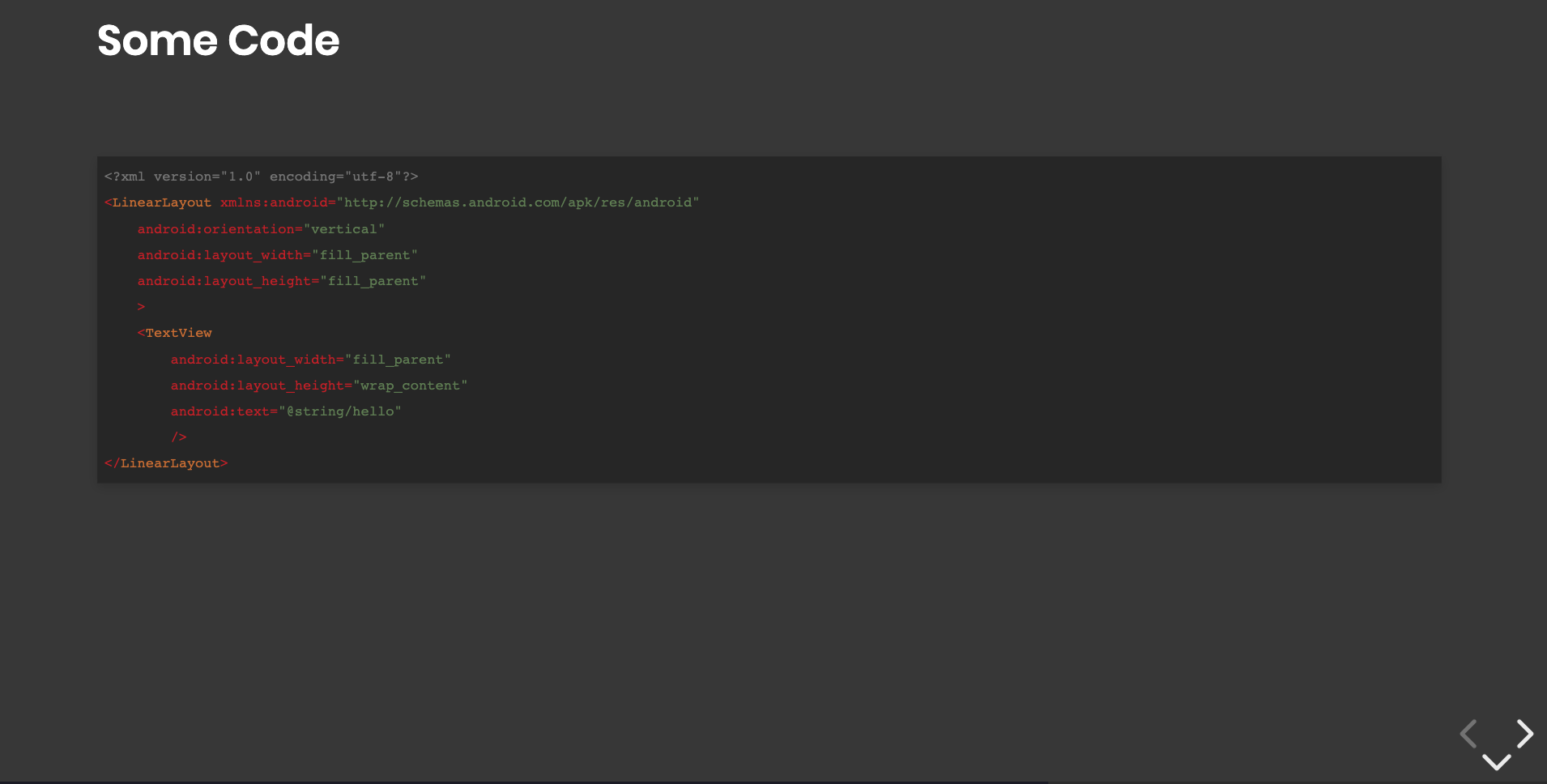
-
with-code-bg-dark: to use a dark theme for code bloc (default is light theme)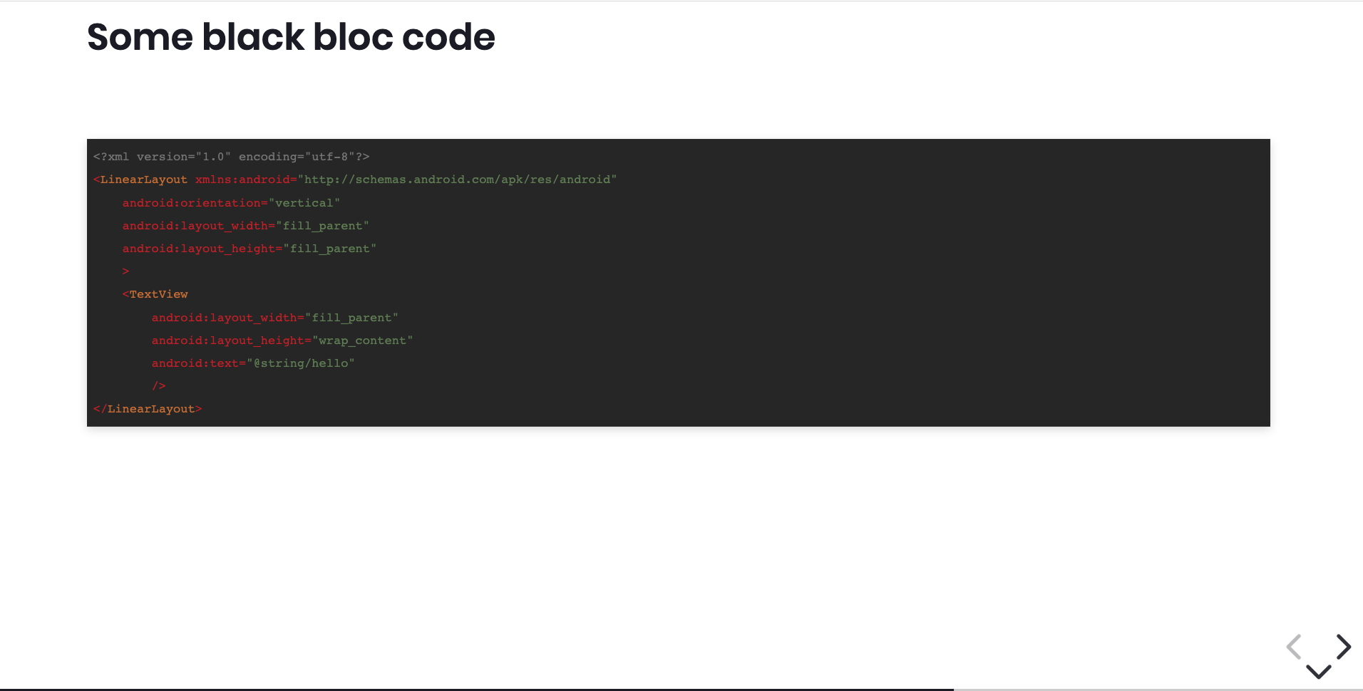
-
consolas: will use consolas font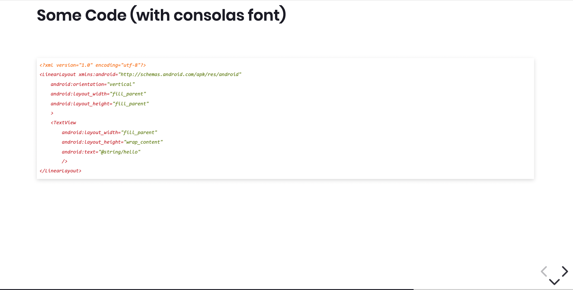
-
inconsolata: will use inconsolata font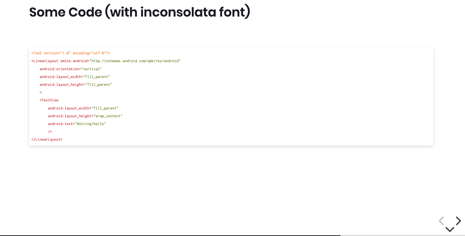
-
big-code: will use a big size of font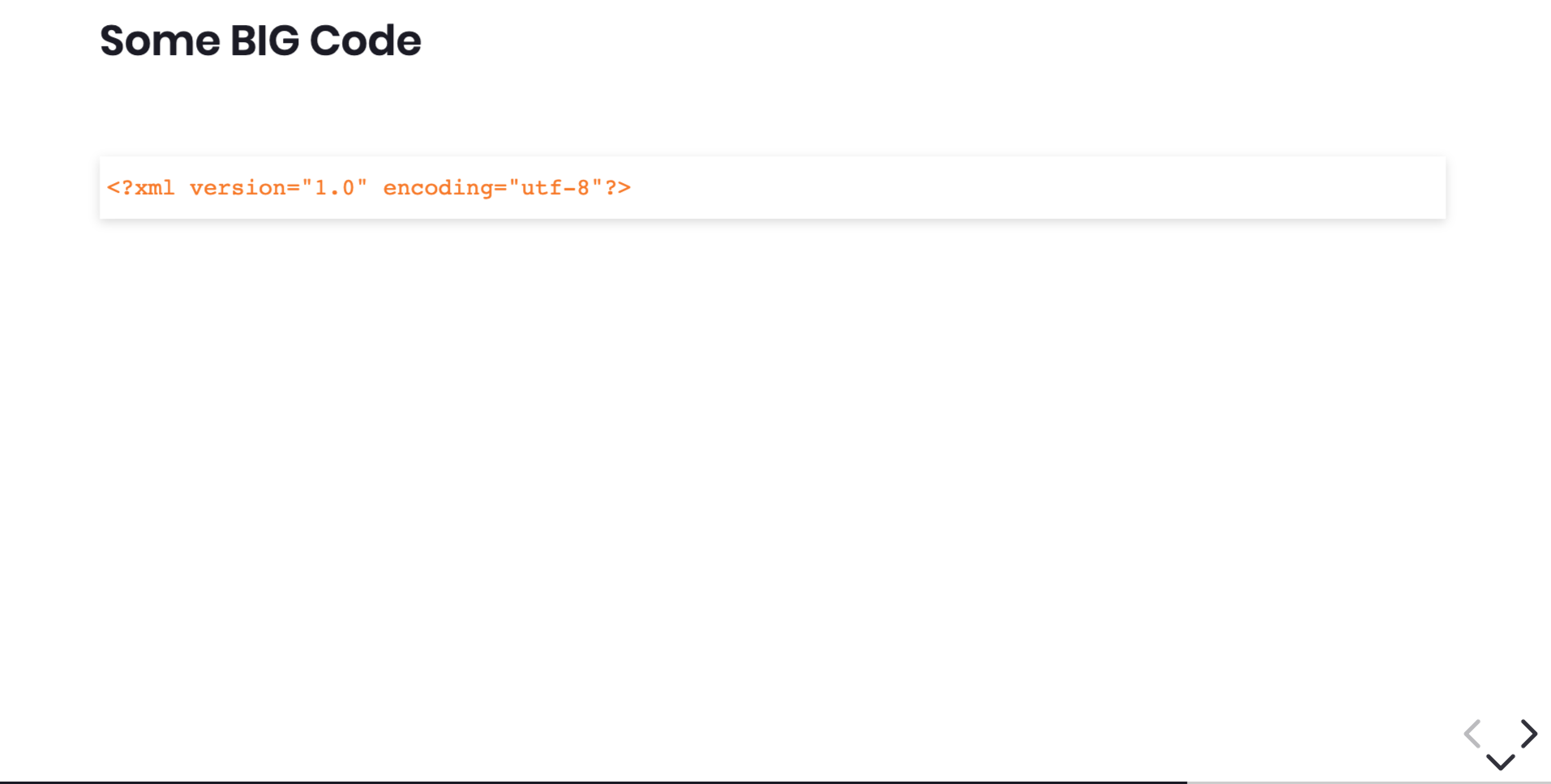
-
max-height: make the code block of the slide take all vertical space. This class should be define on the second as a complement ofwith-codeorwith-code-darkclasses.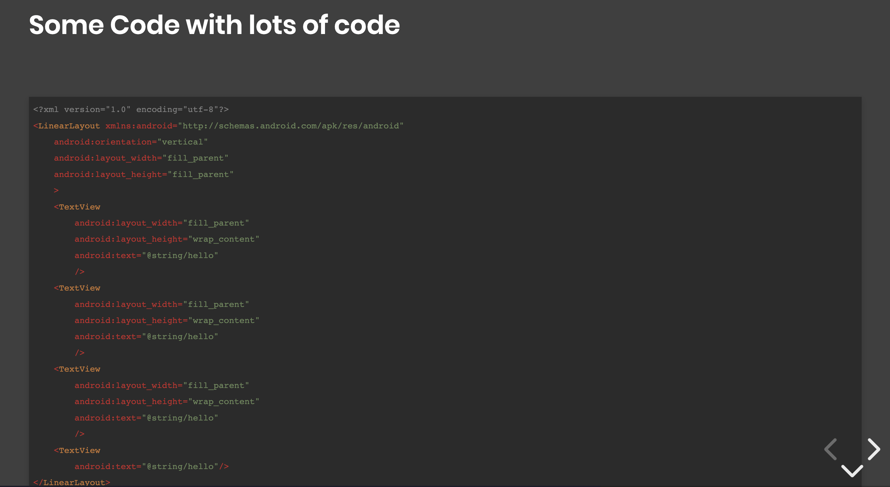


The additional class alone will position the code in the center of screen instead of relative to its parent.
<!-- .slide: class="with-code" -->

## Some Code (with highlighting of individual lines)

` ` `xml [1,7-11]

<?xml version="1.0" encoding="utf-8"?>

<LinearLayout xmlns:android="http://schemas.android.com/apk/res/android"
    android:orientation="vertical"
    android:layout_width="fill_parent"
    android:layout_height="fill_parent"
    >
<TextView
        android:layout_width="fill_parent"
        android:layout_height="wrap_content"
        android:text="@string/hello"
        />
</LinearLayout>
` ` `
You could also use a step by step code highlighting
` ` `xml [1|5-6|7-11]

<?xml version="1.0" encoding="utf-8"?>

<LinearLayout xmlns:android="http://schemas.android.com/apk/res/android"
    android:orientation="vertical"
    android:layout_width="fill_parent"
    android:layout_height="fill_parent"
    >
<TextView
        android:layout_width="fill_parent"
        android:layout_height="wrap_content"
        android:text="@string/hello"
        />
</LinearLayout>
` ` `HighlightJS propose lots of themes that could use.
- Choose your theme : https://highlightjs.org/static/demo/
- Overrides class
with-codeorwith-code-darkin a stylesheet import in your html
// To override the highlightJS theme you can do like this

.with-code {
    @import '../../../node_modules/highlight.js/styles/tomorrow';
}
.with-code-dark {
    @import '../../../node_modules/highlight.js/styles/darcula';
}To produce exercices slides:
<!-- .slide: class="exercice" -->

# Exercice Title

## Exercice

<br>
1. First step
2. Second step
3. Third step
<br>
Additionnal Advice
### Step: push-1
This theme comes with lots of css helpers to help you to position your elements simply
You could center and image with 3 different ways
<!-- First way -->

<!-- Second way -->
<img class="center" src="./docs/images/images/GDG-Logo-carre.png">
You could center an element in the slide with 2 different ways
<!-- First way -->
<div class="full-center">
<img src="./docs/images/images/GDG-Logo-carre.png">
</div>
<!-- Second way : add class on slide but only one image on the page! -->
<!-- .slide: class="full-center" -->

<!-- First way : Add on the slide the class -->
<!-- .slide: class="flex-row" -->
# Flex row alignement with auto wrap
## First way


<!-- Second way : WARNING don't format your code!!
Else revealJS will add some '<p>' tags and destroy the layout -->
<div class="flex-row">
<img class="h-200" src="./docs/images/images/GDG-Logo-carre.png">
<img class="h-250" src="./docs/images/images/GDG-Logo-carre.png">
<img class="h-300" src="./docs/images/images/GDG-Logo-carre.png">
<img class="h-200" src="./docs/images/images/GDG-Logo-carre.png">
<img class="h-350" src="./docs/images/images/GDG-Logo-carre.png">
<img class="h-300" src="./docs/images/images/GDG-Logo-carre.png">
<img class="h-350" src="./docs/images/images/GDG-Logo-carre.png">
<img class="h-200" src="./docs/images/images/GDG-Logo-carre.png">
<img class="h-100" src="./docs/images/images/GDG-Logo-carre.png">
</div>
Some selectors are add to the theme to easily fix size of images in the slide. Note that RevealJS use a mecanism of perspective to preserve size. If you ask to your presentation to be with resolutions 1920x1080, all size you set in your slides will respect that, even if you are on a 1024 screen or bigger.
-
w-N: your image will have a with of N (N between 50px and 1000px by steps of 50px) -
h-N: your image will have a height of N (N between 50px and 1000px by steps of 50px) -
wm-N: your image will have a with-max of N (N between 50px and 1000px by steps of 50px) -
hm-N: your image will have a height-max of N (N between 50px and 1000px by steps of 50px)
you can use thoses helpers in alt or class of your elements
Image (w-500) :

Div background:
<div style="background:red;" class="w-500 h-200"> w-500 h-200</div>
Image :

Div background:
<div style="background:red; width:600px;" class="wm-500 h-200"> (height:600px) wm-500 h-200</div>
Some selectors are add to the theme to easily fix margin-top/bottom of images in the slide to easily trick for the position.
-
mt-N: your image will have a magin-top of N (N between 10px and 1000px by steps of 10px) -
mb-N: your image will have a margin-bottom of N (N between 10px and 1000px by steps of 10px)
you can use thoses helpers in alt or class of your elements


Image :

Div background:
<div style="background:red; width:600px;" class="wm-500 h-200"> (height:600px) wm-500 h-200</div>
To have image that take all the horizontal space, you could use 3 ways:
<!-- First way -->

<!-- Second way -->
<img class="full-width" src="./docs/images/images/logo_sfeir_bleu_orange.png">
You can ask to an image to take the whole height of it's parent
<div style="height:600px; width:100%; background:red;">
    <img class="full-height" src="./docs/images/images/logo_sfeir_bleu_orange.png">
</div>
You can use float-right or float-left display
<!-- First way -->

Lorem ipsum dolor sit amet, consectetur adipiscing elit. Proin nec risus leo. Vestibulum condimentum orci in urna auctor aliquet. Quisque mi erat, placerat non porttitor ut, gravida eu erat. Fusce semper ipsum vel nibh porttitor aliquam. Cras sed porttitor est, id scelerisque odio. Pellentesque sit amet imperdiet ex. Aliquam erat.
<!-- Second way -->
<img class="float-left" src="./docs/images/images/gde.png">
Lorem ipsum dolor sit amet, consectetur adipiscing elit. Proin nec risus leo. Vestibulum condimentum orci in urna auctor aliquet. Quisque mi erat, placerat non porttitor ut, gravida eu erat. Fusce semper ipsum vel nibh porttitor aliquam. Cras sed porttitor est, id scelerisque odio. Pellentesque sit amet imperdiet ex. Aliquam erat.
Lorem ipsum dolor sit amet, consectetur adipiscing elit. Proin nec risus leo. Vestibulum condimentum orci in urna auctor aliquet. Quisque mi erat, placerat non porttitor ut, gravida eu erat. Fusce semper ipsum vel nibh porttitor aliquam. Cras sed porttitor est, id scelerisque odio. Pellentesque sit amet imperdiet ex. Aliquam erat.
You can add a kind of "footer" credit note to the page by adding the class 'credits' of an image or a link
[Source of the image](http://www.sfeir.com)

<!-- .element: class="credits" -->
With this configuration option you can easily create content that is different between, what you will play on stage and what you will give to your attendees without a complete rewrite of your slides. This configuration is a pair between a key specified in your index.html or URL parameters and a key present in your slides.
Index.html Configuration
<body>
    <div class="reveal">
        <div class="slides" data-type-show="prez">...</div>
    </div>
</body>
https://sfeir-school-theme.netlify.app/index.html?type=prez#/
Slides configuration
<!-- .slide: data-type-show="prez" -->

## A slide for prez only

A few words !
The slide 'A slide for prez only' will be visible only if the attribute data-type-show on index.html is set to "prez" or if the type URL parameter is set to prez.
Note that as for the themes described above, the URL parameter takes precedence over the HTML attribute.
With this technique, you can easily create 2 versions of your index.hml, one with data-type-show to prez and one with data-type-showto full and in your slides, you have something like that
<!-- .slide: data-type-show="prez" -->

## A slide for prez only

A few words !

##==##

<!-- .slide: data-type-show="full" -->

## A slide for publication only

Lorem ipsum dolor sit amet, consectetur adipiscing elit. Proin nec risus leo. Vestibulum condimentum orci in urna auctor aliquet. Quisque mi erat, placerat non porttitor ut, gravida eu erat. Fusce semper ipsum vel nibh porttitor aliquam. Cras sed porttitor est, id scelerisque odio. Pellentesque sit amet imperdiet ex. Aliquam erat.
If nothing is set in the markdown, the slide will be available for both versions.
You can also set multiples data-type-show in the same slide (separated by a space) to create kind of specifics configurations for your slides.
<!-- .slide: data-type-show="prez other" -->Sometimes, you will need to use revealJS fragments (animation to reveal an element) on list elements. To do this, you could write directly html content or you can use a meta at the end of the list:
1. List Item 1
2. List Item 2
3. List Item 3
 <!-- .element: class="list-fragment" -->

-   Item 1
-   Item 2
-   **Item 3**
<!-- .element: class="list-fragment" -->
This will apply on all elements of the list the class fragment or use html
<ol>
    <li class="fragment">List Item 1</li>
    <li class="fragment">List Item 2</li>
    <li class="fragment">List Item 3</li>
</ol>

<ul>
    <li class="fragment">Item 1</li>
    <li class="fragment">Item 2</li>
    <li class="fragment"><strong>Item 3<strong></li>
</ul>In this new version, you could use the library of icons : feather icons.
You can use it in 2 way, a Hachky way using markdown image syntax or the normal way with html tag.
The "hacky" way plays with mardown image syntax : . So to add a feather icon, you will do this : . The image will be replaced by the correct html.
We introduce some extensible capabilities :
- Add
smallorbigattribute to change the size :- Without
smallorbig: default size is48px - With
small: size is24px - With
big: size is96px
- Without
- You can define your own custom size using html custom properties in the style of image (see example after) :
--icon-size - By default, the color of icons follow the mode of presentation (school (green) or institute (blue)). You can add your custom colors using custom properties in the style of image (see example after) :
--icon-color
## Use Feathers icons
Using markdown image
 basic icon
 small icon
 big icon
<!-- .element: style="--icon-size:96px; --icon-color:orange;" --> custom icon and custom color
Using html
<i data-feather="github" ></i> basic icon
Complete list of icons : https://feathericons.com/
You can you admonition blocks to highlight some content in your slides. You can use the following classes:
abstractinfotipnotesuccessquestionwarningfailuredangerimportantbugexamplequote
Simply add the class "admonition" with the tip desired as class to transform the text into admonition. This is target for text!
Mode tip

<!-- .element: class="admonition tip" -->
will produce

to do this in html :
<p class="admonition tip">>Mode tip</p>You can also specify your own icon if you want using 'custom' as class. To specify the icon to use, you will have to add data attribute on your element data-admonition-icon with the icon. We recommand you to use Emojis as icon.
There is a default grey background color but if you want, you can customize it using the custom property --admonition-bg-color in the style of the element.
Mode custom

<!-- .element: class="admonition custom" data-admonition-icon="🐼 Custom" -->

Mode custom and custom color

<!-- .element: class="admonition custom" data-admonition-icon="🕶️ Custombis" style="--admonition-bg-color:#d7be00;" -->
this will produce

Here are all the icons availables and modes :

To select the slides to display, you have to give to the initializer a function that will return an array of objects with the path of the slides. So to choose your slide, you normally return 'only' the selected slides.
You can also use the 'Slide selector' UI to select your slides. To do this, hit the key 'c' when you presentation is loaded. You will see a modal with all the slides availables. You can select the slides you want to display and click on the 'Validate selection' button. Only the selected path will be displayed.
The selection is stored in session storage so if you reload the page, the selection will be kept. But if you close the window or tab, the selection will be lost.
This UI will let you also configure the theme (institute / school / conf), the langage (FR / EN) and the type (prez / full / ...).

To print your presentation, simply follow the reveal.js tutorial : Pdf Export
| Configuration | Description |
|---|---|
index.html?print-pdf&show-notes |
Show the notes in the exported page. |
<div class="slides" data-show-notes/> |
Show the notes in the exported page. |
<div class="slides" data-show-notes="separate-page"/> |
Show the notes of the exported page in a separate page. |
<div class="slides" data-pdf-max-pages-per-slide="1"/> |
Ensures that one slide is printed as one page. |
index.html?print-pdf&pdf-max-pages-per-slide=1 |
Ensures that one slide is printed as one page. |
<div class="slides" data-pdf-max-pages-per-slide="<number>"/> |
Ensures that one slide is printed as <number> page maximum. |
<div class="slides" data-pdf-dont-separate-fragments/> |
Ensure that fragments are not separated in multiple pages. |
index.html?print-pdf&pdf-dont-separate-fragments |
Ensure that fragments are not separated in multiple pages. |