React Simple Charts
A collection of React Components usefull for creating dashboards or other type of number formatting. Currently there are 3 components: Area, BarMetric, and CirclePie.
Usage
npm install --save react-simple-charts
import {Area, CirclePie, BarMetric} from 'react-simple-charts'
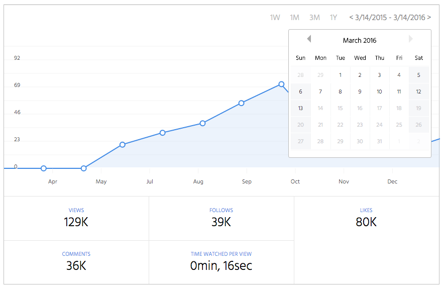
Area
A pure React/SVG charting library.
Input data
Data input is specified as follow: [{time: Unix MS timestamp, value: yValue, label: Text shown for this value}]
Default Props
{
    width: 640,
    height: 320,
    border: 'none',
    strokeWidth: 2,
    useDynamicYMin: false,
    strokeColor: '#408AE5',
    pointsRadius: 5,
    tipsWidth: 240,
    tipsHeight: 22,
    tipsPadding: 10,
    tipStrokeWidth: 1,
    tipStrokeColor: '#BBBBBB',
    tipsFill: 'white',
    gridColor: 'rgba(230,230,230,.5)',
    labelFontSize: 12,
    labelTextShadow: '1px 1px #fff',
    labelColor: '#555',
    fillColor: 'rgba(191, 216, 246, 0.3)',
    maxOverflow: 20,
    yLabelsOutside: false,
    yLabelsPosition: 'left',
    yPadding: 10,
    data: [],
}
Sample use:
import Area from 'react-area-chart'

let data = [
    {time:1422766800000, value: 0, label: "active users"},
    {time:1422853200000, value: 10, label: "active users"},
    {time:1422939600000, value: 5, label: "active users"}
];
<Area width={900} height={300} data={data}/>
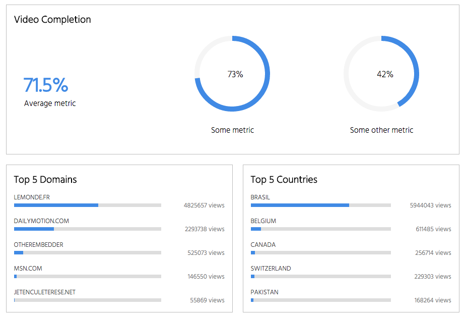
Bar Metric
A micro bar metric component.
Default Props
{
    metricName: 'points',
    value: 0,
    percent: 100,
    label: 'N/A'
}
Sample use:
import BarMetric from 'react-bar-metric'

<BarMetric label="Share of IE" percent={5} metricName="Nearing Zero"/>
Circle Pie
A micro component for rendering a percentage value as an SVG circle.
Default Props
{
    width: 150,
    height: 150,
    border: 'none',
    strokeWidth: 10,
    labelColor: '#111111',
    labelFontSize: '18px',
    strokeColor: '#408AE5',
    railColor: '#f5f5f5',
    fillColor: 'none',
    percent: 70,
    padding: 0,
}
Sample use:
import CirclePie from 'react-circle-pie'

<CirclePie percent={5}/>
Dependencies
The following libraries are peer dependencies and are expected to be included in your own package:
- Moment.js >= 2.0.0
- React >= 0.14.0
- ReactDom >= 0.14.0
Credits
Made with love at Dailymotion in NYC. Designed by Leury Hidalgo and created by Samuel Delesque.