the grid will store column configuration in browser local storage (based off of stateKey, so the key must be unique across all grids in a single application)
height
oneOfType([number, string, bool])
the height of the grid container, if false, then no height will be set
the placeholder that will be used for the editor input
validator
func
a func that should return a boolean, to determine if the newly input value is valid
change
func
a func that should return an object where keys are the dataIndex of affected columns, and the values will be the new values associated with that dataIndex.
editable
oneOfType([func, bool])
whether the field should be disabled while in edit mode.
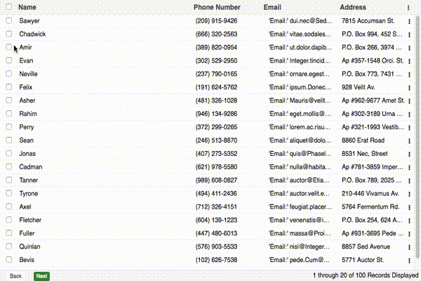
return`${pageIndex * pageSize} through ${pageIndex * pageSize + currentRecords} of ${total}${recordType} Displayed`;
},
pagerComponent:false
}
};
Prop
Type
Description
enabled
bool
whether a pager will be used, defaults to true
pagingType
oneOf(['local', 'remote'])
defaults to local
toolbarRenderer
func
a function which which returns the description of the current pager state, ex: 'Viewing Records 10 of 100'
pagerComponent
jsx
if you'd like to pass your own pager in, you can supply a jsx element which will replace the pager entirely
Grid Actions
exportconstplugins={
GRID_ACTIONS:{
iconCls:'action-icon',
onMenuShow:({ columns, rowData })=>{
console.log('This event fires before menushow');
if(rowData.isDisabled){
return['menu-item-key']// this field will now be disabled
}
},
menu:[
{
text:'Menu Item',
key:'menu-item-key',
EVENT_HANDLER:()=>{
alert('Im a menu Item Action');
}
}
]
}
};
Prop
Type
Description
iconCls
string
class to be used for the action icon
menu
arrayOf(object)
menuItems, with text, key, EVENT_HANDLER properties. each object must contain a unique key relative to it's parent array. These keys will be used as the JSX element key.
onMenuShow
func
a method that fires upon menu action click. @return an array of keys to disable menu items that correspond with these keys.
determines whether a single value, or multiple values can be selected
editEvent
oneOf(['singleclick', 'doubleclick', 'none'])
what type of mouse event will trigger the editor
enabled
bool
whether the selection model class is initialized
allowDeselect
bool
whether a value can be deselected
activeCls
string
the class applied to active rows upon selection
selectionEvent
oneOf(['singleclick', 'doubleclick'])
the browser event which triggers the selection event
Error Handler
exportconstplugins={
ERROR_HANDLER:{
defaultErrorMessage:'AN ERROR OCURRED',
enabled:true
}
};
Prop
Type
Description
defaultErrorMessage
string
the default error message to display when no error information is available
enabled
bool
whether the error handler should be initialized
Loader
exportconstplugins={
LOADER:{
enabled:true
}
};
Prop
Type
Description
enabled
bool
whether the loading mask should be initialized
Bulk Actions
exportconstplugins={
BULK_ACTIONS:{
enabled:true,
actions:[
{
text:'Bulk Action Button',
EVENT_HANDLER:()=>{
console.log('Doing a bulk action');
}
}
]
}
};
Prop
Type
Description
enabled
bool
whether the bulk action toolbar should be used
actions
arrayOf(object)
the actions (including button text, and event handler) that will be displayed in the bar
Row renderer
exportconstplugins={
ROW:{
enabled:true,
renderer:({rowProps, cells, row})=>{
return(
<tr {...rowProps }>
{ cells }
</tr>
);
}
}
};
Prop
Type
Description
enabled
bool
whether the bulk action toolbar should be used
renderer
func
function which returns the row contents for this row
Events
All grid events are passed in as a single object.
exportconstevents={
HANDLE_CELL_CLICK:()=>{},
HANDLE_CELL_DOUBLE_CLICK:()=>{},
HANDLE_BEFORE_ROW_CLICK:()=>{},
HANDLE_ROW_CLICK:()=>{},
HANDLE_ROW_DOUBLE_CLICK:()=>{},
HANDLE_BEFORE_SELECTION:()=>{},
HANDLE_AFTER_SELECTION:()=>{},
HANDLE_BEFORE_INLINE_EDITOR_SAVE:()=>{},
HANDLE_AFTER_INLINE_EDITOR_SAVE:()=>{},
HANDLE_BEFORE_BULKACTION_SHOW:()=>{},
HANDLE_AFTER_BULKACTION_SHOW:()=>{},
HANDLE_BEFORE_SORT:()=>{},
HANLE_BEFORE_EDIT:()=>{},
HANDLE_AFTER_SELECT_ALL:()=>{},
HANDLE_AFTER_DESELECT_ALL:()=>{},
HANDLE_AFTER_ROW_DROP:()=>{},
HANDLE_BEFORE_TREE_CHILD_CREATE:()=>{},
HANDLE_EDITOR_FOCUS:()=>{},
HANDLE_EDITOR_BLUR:()=>{}
};
Each function is passed two arguments, the first is a context object which will contain metadata about the event, and the second argument is the browser event if applicable.
All core components and plugins have corresponding .styl files that can be extended or overwritten. Class names have also been modularized and are available to modify or extend within src/constants/gridConstants.js
To update CLASS_NAMES or the CSS_PREFIX dynamically, you can use the applyGridConfig function. More information is available here.


