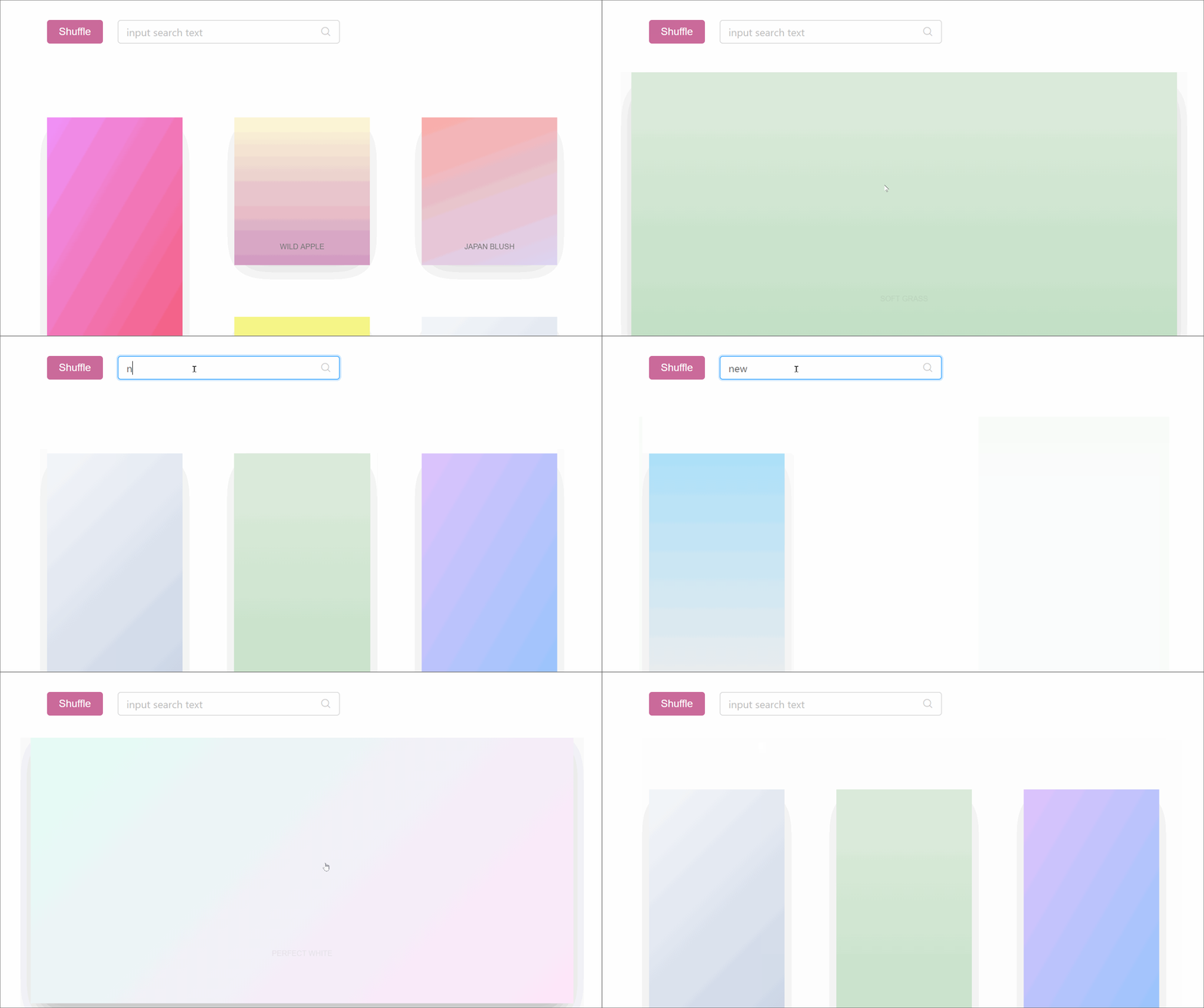
npm install mauerwerk

Demo: https://codesandbox.io/embed/0582jolnl
Simplified Demo: https://codesandbox.io/embed/z6ly40071p
How to use
import Grid from 'mauerwerk' <Grid // , , , . = // , = // ( ) // % = // ( /) = // = // = // = // () => data open toggle <div> datatitle open && <div>Opened/maximized content here</div> <button =>open ? 'Close' : 'Open'</button> </div> </Grid>You feed mauerwerk any data-set (an array of objects most likely), give it accessors so it can access keys (which can be names, hashes, etc., the same keys you'd normally hand over to React), and either a fixed cell height or individual heights. You render out each individual cell via render-prop. You'll receive three arguments:
data, the item from your data-setopen, the cells state, depending on whether it istrueorfalseyou can display varying content or use further animation prototypes to transition from cell-state to maximized-statetoggle, use this to maximize/minimize your cell
Effects
You probably don't want flip between open/closed content using static conditions. mauerwerk comes with two simple to use effects:
Fadewill fade contents in according to theshowproperty. It's a simgple wrapper around react-spring'sTransition, you can feed it the same properties (config, from, enter, leave, update). By default it will just move opacity from 0 -> 1.Sluglets elements "crawl" in. It's a wrapper around react-spring'sTrail. By default it will move opacity from 0 -> 1 and translate y from 40px -> 0px.
These two would work outside the Grids context if you wanted to use them elsewhere.
import Grid Slug Fade from 'mauerwerk' <Grid > data open toggle <div> <Fade => <Slug> <h1>Opened content</h1> <span>Some text</span> <button =>Close</button> </Slug> </Fade> <Fade => <Slug> <h1>Cell content</h1> <span>Some text</span> <button =>Open</button> </Slug> </Fade> <div>Content that would apply to both open and closed state</div> </div> </Grid>mauerwerk depends on react-spring and react-measure.