
Contentful-wizard
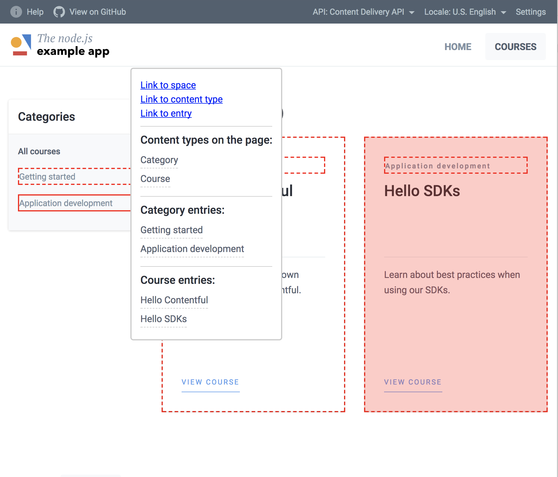
This is a library to add an interactive content explorer to your contentful-powered project – it allows you to mark parts of your application, and this library will highlight marked block, add automatic tooltips on hover with links to contentful application.
It allows your editors quickly understand which element on the page is responsible for specific entry and content type (or an asset, if you want to mark it to this details).
The example app: live demo | integration commit
Blog example: live demo | integration commit


This is only client-side library, it assumes DOM is available. Right now it is in pre-alpha stage, but you can take a look at the roadmap to get a feeling what is going to be implemented.
This library is in alpha stage – it is a proof of concept with (likely) a lot of bugs. Feedback is welcome!
Contribution
This project is part of contentful-userland which means that we’re always open to contributions and pull requests. You can learn more about how contentful userland is organized by visiting our about repository.
Getting started
First, you need to include this library into your application – you can just include umd build. It will add a global object, which you can call to instantiate a wizard – this will iterate over all DOM elements, picking those with data-ctfl-entry and data-ctfl-asset data attributes, highlight borders of these elements and add tooltips on hover with all links and info about other elements on the page.
You can customize a lot of things, but this is the bare minimum, which might be enough
<script src="https://unpkg.com/contentful-wizard@0.0.1-alpha-6/dist/contentful-wizard.min.js"></script>

<div data-ctf-content-type="17WjnjeALEOeSyuiMI4QOx" data-ctfl-entry="VQGkwljpe0AmqOmOuW8i9">
  <!-- your entry content -->
</div>

<div data-ctfl-asset="6nvWJT1AkM64so8Auue4Qx">
  <!-- your asset content -->
</div>

<script>
CTFLWizard.init({
  spaceId: 's25qxvg',
  key: 'f78aw812mlswwasw' // your API key
});
</script>
Entry titles
In the tooltip's content we show:
- content types on the page
- entries on the page
- assets on the page
Content types and assets have special properties (name for content types and fields.title for assets), but entries have only specified fields, so there is no way to generalize it. In order to address it, and to list entries in human-readable form, you can pass an entryTitle property into CTFLWizard.init method configuration object. There are several strategies supported:
CTFLWizard.init({
  spaceId: 's25qxvg',
  key: 'f78aw812mlswwasw', // your API key
  // if all your entries should show this field's value
  entryTitle: 'myTitle',

  // or, if you need to display different fields
  // for different content types
  entryTitle: {
    [contenTypeId]: 'mySpecialTitle'
  }
});
If you don't provide any (or fields by your strategy don't exist or don't have a value), the library will try to get title field first, and then name. However, it is still pretty magical, so it is better to provide your own field names.
There is no "smart" guessing strategy (like trying to list all fields with string value and get one with a short enough value), since it can easily introduce incosistency, and it will become confusing.
Initialization
In default configuration there is pre-configured host for you published entries and assets. If you need to work with preview items define a custom host as
initparameter.
CTFLWizard.init({
  spaceId: 's25qxvg',
  key: 'f78aw812mlswwasw', // your API key
  host: 'preview.contentful.com' // preview host
});
Styling
Your use-case might be different – for example, you need wide tooltips, or default colours don't match your schema; you can customize all default styles, except positioning (top, left, right, bottom), it is calculated automatically and adjusted to the content. You provide your own styling during calling CTFLWizard.init, and you can omit any of these properties, and the whole property is optional – below you can find a commented breakdown on all style options:
Since it is in pre-alpha (read: super-early) and styles are subject to change, I don't want to share styles to avoid frequent updates. Once it stabilizies, all default styles will be shown in this snippet
CTFLWizard.init({
  spaceId: 's25qxvg',
  key: 'f78aw812mlswwasw', // your API key

  // the whole property is optional
  style: {
    // style of the container to indicate
    // that it has hover capabilities
    highlight: {
      border: '2px dashed #ccc'
    },
    // style during the hover
    highlightHover: {
      border: '2px solid #ccc'
    },
    // styles of the tooltip itself
    tooltip: {
      background: '#ccc'
    },
    // overlay – when we hover types in the tooltip
    // we add overlay to corresponding elements
    overlay: {
      background: 'green'
    }
  }
});
Environments
Contentful-wizard now supports environments It is optional feature with default 'master' value
CTFLWizard.init({
  spaceId: 's25qxvg',
  key: 'f78aw812mlswwasw', // your API key
  environment: 'development' //environment name
  })
Update Tooltips
Create wizard instance initializes the library, attaching listeners to all elements with corresponding data-attributes to show tooltip on hovering. However, sometimes you change content on your page, and you would like to add tooltips for new content. In order to do that, you can invoke .update method on returned instance:
You can provide an arg for
updatemethod – it is an object with the same parameters as forinit, so you can override any parameters you had set up before
const wizard = CTFLWizard.init({
  spaceId: 's25qxvg',
  key: 'f78aw812mlswwasw'
});

// after some changes
wizard.update({
  // new entry title field resolution
  entryTitle: 'newTitle'
});
Another use case is to remove all listeners completely – for example, you re-rendered everything, or contentful content became irrelevant. In order to do that, you can call .destroy method:
const wizard = CTFLWizard.init({
  spaceId: 's25qxvg',
  key: 'f78aw812mlswwasw'
});

// if you want to remove all contentful-wizard functionality
wizard.destroy();
Single Page Applications
In case you have rich web application, where content can change very often, and the whole page updates don't make a lot of sense, since they happen too often, there is a way to attach/deattach them manually:
import { attach, init } from 'contentful-wizard';

init({
  spaceId: 'your_space',
  key: 'CDA_key'
});

const cancel = attach({
  node: document.getElementById('myEntry'),
  spaceId: 'your_space',

  // in case you have an entry
  contentType: '<Content Type ID>',
  entry: '<Entry ID>',
  // optional, by default 'title' and 'name' will be tried
  entryTitle: 'myTitleField',

  // in case you have an asset
  asset: '<Asset ID>',

  // in case you want to provide your content on top
  // of the tooltip
  description: 'This is our main story',

  // If you want to override styles for this specific
  // node. They will be merged with passed in `init` fn
  // for structure see https://github.com/Bloomca/contentful-wizard#styling
  style: { ... }
});
In practice, using modern frameworks, it makes sense to add them in lifecycle hooks. I'll show it using react lifecycle hooks as an example, but it works similarly across all popular frameworks.
// init during the bootstrap of your application
import { init } from 'contentful-wizard';

// this is needed to save your key
init({
  spaceId: 'your_space',
  key: 'CDA_key'
});

// wizard component to wrap contentful blocks
import React, { Component } from 'react';
import RPT from 'prop-types';
import { attach } from 'contentful-wizard';

export default class CTFLWizard extends Component {
  static propTypes = {
    children: RPT.node,
    entity: RPT.object,
    description: RPT.string
  }

  componentDidMount() {
    const { entity, description } = this.props;
    const isEntry = entity.sys.type === 'Entry';

    // mount tooltip on our container
    this.cleanup = attach({
      node: this.node,
      // decide which type of contentful entity we have
      entry: isEntry ? entity.sys.id : undefined,
      contentType: isEntry ? entity.sys.contentType.sys.id : undefined,
      asset: isEntry ? undefined : entity.sys.id,
      spaceId: entity.sys.space.sys.id,
      // description for the tooltip
      description
    });
  }

  componentWillMount() {
    this.cleanup && this.cleanup();
  }

  render() {
    const { children } = this.props;

    return (
      <div ref={node => this.node => node}>
        {children}
      </div>
    );
  }
}

// later, in another component:
import Wizard from '../components/wizard';

// ...
const markup = (
  <Wizard entity={course}>
    {course.fields.description}
  </Wizard>
);
As you can see, you just have to initialize to save CDA key, and then write one component, which will attach and cleanup tooltips based on the lifecycle hooks.
Roles and Permissions
Contentful can have pretty intrinsic set of rules and permissions, and it is possible that all presented options can be confusing, since some roles don't have access to some parts of the application (for example, to content types). Unfortunately, right now there is no way to differentiate between roles – we are using CDA (or CPA) key, which is valid to get content of the whole space.
However, there are couple of things in the roadmap:
- configuration of the tooltip (so you can configure it to omit some parts of the tooltip)
- control panel to show only some parts
Please, create an issue in case you feel this is important (and if you have another idea, you are welcome to share it!).
Contributing
All contributions are more than welcome! If you want to add some new feature, I'd kindly ask you to create an issue first, so we can discuss the solution first – since the goal of this library is pretty abstract, it makes sense to discuss problem first, and only afterwards implement it, right?
You can take a look at the Roadmap, in order to feel what is going to be implemented. If you feel something does not make sense, or can be done better, please submit an issue as well!
License
MIT