
Bulma's pure JavaScript extension to display toasts. Basically a Bulma's notification implemented as a toast plugin.
The plugin comes with the following options:
-
message: The actual message to be displayed. It can be a string, a template string, or a DOM node. See examples. This is required. -
type: Essentially a Bulma's css class. It can beis-primary,is-link,is-info,is-success,is-warning,is-danger, or any other custom class. Default is a whitesmoke background with dark text as shown here. -
duration: Duration of the notification in milliseconds. Default is2000milliseconds. -
position: Position where the notification will be shown. The default istop-right, so if you want it to be on the top-left just addtop-leftto this option. The available options are:top-left,top-center,top-right,center,bottom-left,bottom-center, andbottom-right. -
dismissible: Whether the notification will have a close button or not. Default isfalse. -
pauseOnHover: Pauses delay when hovering the notification. Default isfalse. -
single: Only show a single toast inappendTo. Default isfalse. -
closeOnClick: Dismisses the notification when clicked. Default istrue. -
opacity: The notification's container opacity. Default is1. -
animate: See here. Default is no animations. -
appendTo: By default, the notification will be appended todocument.body. Pass a different Node to have it appended else where in the DOM. -
extraClasses: Adds classes for styling the toast notification.
npm install bulma-toast
or
yarn add bulma-toast
- Link to bulma-toast.min.js
<script src="bulma-toast.min.js"></script>- Use bulma-toast to display a toast
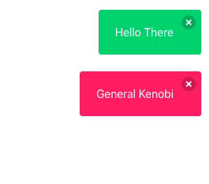
bulmaToast.toast({ message: 'Hello There' })
bulmaToast.toast({ message: 'General Kenobi', type: 'is-danger' })// Import the toast function
import * as bulmaToast from 'bulma-toast'
// Or use
// import { toast as superToast } from 'bulma-toast'
// to rename your import
toast({
message: 'Hello There',
type: 'is-success',
dismissible: true,
animate: { in: 'fadeIn', out: 'fadeOut' },
})A simple default object to prevent errors. Your options will be merged with these and the defaults will be used if the fields are not provided.
{
  "duration": 2000,
  "position": "top-right",
  "closeOnClick": true,
  "opacity": 1,
  "single": false,
  "offsetTop": 0,
  "offsetBottom": 0,
  "offsetLeft": 0,
  "offsetRight": 0
}
The default config can be updated using the funcion setDefaults. Also, it's possible to reset to the default config using resetDefaults
bulmaToast.setDefaults({
  duration: 1000,
  position: 'top-left',
  closeOnClick: false,
})bulmaToast.setDoc(window.document)This can be changed before each toast call and can be set to eny element.
Bulma Toast supports animate.css (and maybe others?). You MUST include animate.css on your document's <head>
<head>
  <link rel="stylesheet" href="animate.min.css" />
  <!-- or -->
  <link
    rel="stylesheet"
    href="https://cdn.jsdelivr.net/npm/animate.css@4.0.0/animate.min.css"
  />
  <!-- or -->
  <link
    rel="stylesheet"
    href="https://cdnjs.cloudflare.com/ajax/libs/animate.css/4.0.0/animate.min.css"
  />
</head>
Accepts a object with in and out with css classes to add animations. Using Animate.css you would pass a object like this:
  {
    message: "I'm animated! Yay!",
    duration: 2000,
    position: "top-right",
    animate: { in: 'fadeIn', out: 'fadeOut' }
}Warning: Don't use opacity when using animations. Some of them use the opacity property like fade in and fade out.
import { toast } from 'bulma-toast'

toast({
  message: 'Hello There',
  type: 'is-success',
  dismissible: true,
  pauseOnHover: true,
})

toast({
  message: '<h1>LOOK HERE</h1>',
  type: 'is-danger',
  dismissible: true,
  pauseOnHover: true,
  animate: { in: 'fadeIn', out: 'fadeOut' },
})

const myMessage = `It's ${new Date().toDateString()}`

toast({
  message: myMessage,
  type: 'is-primary',
  position: 'center',
  closeOnClick: true,
  pauseOnHover: true,
  opacity: 0.8,
})

const elm = document.createElement('a')
elm.text = 'Visit my website!'
elm.href = 'https://rfoel.com'

toast({
  message: elm,
  type: 'is-warning',
  position: 'center',
  closeOnClick: true,
  pauseOnHover: true,
  animate: { in: 'fadeIn', out: 'fadeOut' },
})Issues and pull requests are welcome.