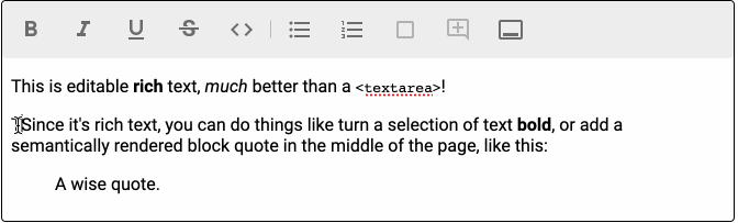
Rich text editor is a React component based on Slate with the Material UIlook and feel.
Status: alfa. Pending:
- Improve documentation
- Improve performance
- Create unit tests
Install
npm install --save @unicef/material-slate
Include the editor in your component
import React from "react"
import { useState, useMemo } from "react"
import {
  MaterialSlate,
  MaterialEditable,
  createMaterialEditor,
  Toolbar
} from '@unicef/material-slate'

export default function MyComponent() {
  // Holds the value of the editor
  const [value, setValue] = useState({})

  // An instance of material editor. It is an slate editor with a few more functions
  const editor = useMemo(() => createMaterialEditor(), [])

  return (
    <MaterialSlate editor={editor} value={value} onChange={(value) => setValue(value)}>
      <Toolbar />
      <MaterialEditable />
    </MaterialSlate>
  )
}Because this editor is just a wrapper of Slate, it can be fully extended following the Slate docs.
Two types of button bars can be added:
-
<Toolbar />. Regular button bar that appears at the top -
<HoveringToolbar />). A toolbar that appears over a selected text. It is displayed only when a text is selected.
Toolbars shall be included within <MaterialSlate /> component.
By default both toolbars display a predefined set of buttons. To customize the buttons that appear in your toolbar, add the buttons you want as children.
For example if you want to display only bold and italic buttons:
//...
import { BoldButton, ItalicButton } from '@unicef/material-slate'
//...

//...
<HoveringToolbar >
  <BoldButton />
  <ItalicButton />
</HoveringToolbar>
The complete list of available buttons is in /src/component/Buttons folder.
In order to create your custom behavior you can add a ToolbarButton in a toolbar.
The steps
- Add the customized
ToolbarButtonto the toolbar - Extend
renderElement
You have a complete example in advanced example
In order to extend the components, clone the project and install the dependencies.
git clone https://github.com/unicef/material-slate.git
cd material-slate
npm install
npm start
In another window, we can launch the example app
cd example
npm startBuilds the library of components in the dist folder.
npm startApart from the documentation The package comes with an example app - create-react-app - which is useful for testing and running the components.
cd example
npm install # only if it is first time
npm start
Runs the app in the development mode. Open http://localhost:3000 to view the app in the browser.
It will reload automatically upon edits. Lint errors are also displayed on the console.
Builds the component library for production. Leaves the output in the dist folder.
Generates the documentation to be viewed in http://localhost:6060.
Page reloads on any change. Lint errors are displayed in the console, too.
We use styleguidelist for documenting our custom components.
Builds the styleguide and leaves the output is the styleguide/ folder.
Builds the both example and styleguide for production. Leaves the output in the gh-pages-build folder.
Deploys the output of build:site in the gh-pages.
Publishes the package in npm.
UNICEF works in over 190 countries and territories to protect the rights of every child. UNICEF has spent more than 70 years working to improve the lives of children and their families. In UNICEF, we believe all children have a right to survive, thrive and fulfill their potential – to the benefit of a better world.
Just fork the project and make a pull request. You may also consider donating.
Copyright 2020 UNICEF http://www.unicef.org Developed by ICTD, Solutions Center and Support, Digital Tools and Platforms, Custom Applications Team, New York.
Permission is hereby granted, free of charge, to any person obtaining a copy of this software and associated documentation files (the "Software"), to deal in the Software without restriction, including without limitation the rights to use, copy, modify, merge, publish, distribute, sublicense, and/or sell copies of the Software, and to permit persons to whom the Software is furnished to do so, subject to the following conditions:
The above copyright notice and this permission notice shall be included in all copies or substantial portions of the Software.
THE SOFTWARE IS PROVIDED "AS IS", WITHOUT WARRANTY OF ANY KIND, EXPRESS OR IMPLIED, INCLUDING BUT NOT LIMITED TO THE WARRANTIES OF MERCHANTABILITY, FITNESS FOR A PARTICULAR PURPOSE AND NONINFRINGEMENT. IN NO EVENT SHALL THE AUTHORS OR COPYRIGHT HOLDERS BE LIABLE FOR ANY CLAIM, DAMAGES OR OTHER LIABILITY, WHETHER IN AN ACTION OF CONTRACT, TORT OR OTHERWISE, ARISING FROM, OUT OF OR IN CONNECTION WITH THE SOFTWARE OR THE USE OR OTHER DEALINGS IN THE SOFTWARE.