
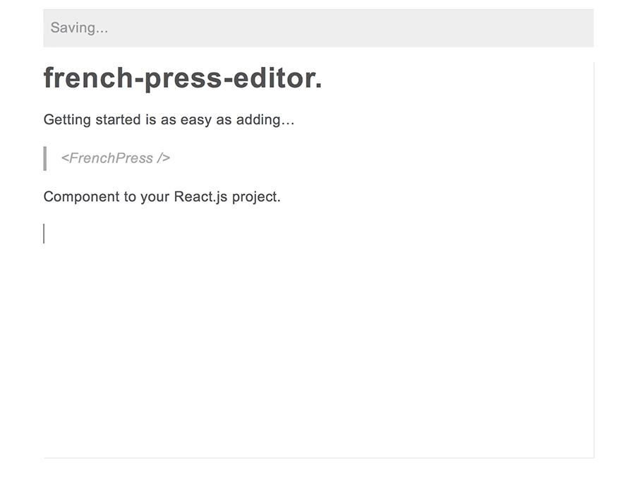
☕ An offline-first rich text editor component.
- Offline-ready: store content and images (!) in-browser.
- Much better than ContentEditable: don't make your users and developers suffer!
- You're done: get it working in five minutes or customize it with your own styles, plugins, and components.
- Analog.Cafe: a film photography magazine.
yarn add @roast-cms/french-press-editor
french-press-editor was built for fast installation and with a pre-defined set of tools. It's meant to make a good editorial experience that has most of the required features of a typical blog or magazine entry for your users with the absolute minimum required from you, the developer. This tool is extendable, via Slate's plugins infrastructure, however, it has some prerequisites and opinionated limitations.
- Get your WebPack/React.js environment ready (see React.js environment below).
- Install packages listed in peer dependencies section below.
- Run the code from MVP section (below) in your
index.js.
In order for you to use this tool you'll need to have React.js development environment working on your machine. If you don't and don't know where to start, have a look at create-react-app. CRA will take care of everything that you need for you, though if you have your own system please make sure that you've got Babel transpiler, with an ability to load imports dynamically, understand spread operators, and this: babel-plugin-transform-class-properties.
There are a few peer dependencies that you will need to install and manage yourself in order to use french-press-editor. The reason for this is that they tend to be used in other parts of blog and publication apps, so to keep the bundle size as small as possible you are being forced to use a single version of those components throughout. Here's what you'll need:
"peerDependencies": {
  "immutable": "^3.8.2",
  "react": "^16.0.0",
  "react-dom": "^16.0.0",
  "react-router-dom": "^4.2.2"
}
You can run yarn add immutable (and so fourth) on all of the above packages.
index.js in this folder gives you a complete example with full usage API (aside from importing custom components and plugins). However, to get started you don't need to build all that. Assuming you got your environment working and have all the dependencies installed this is what your component should have at minimum in order to render:
//
// tools
import React from "react"
import {render} from "react-dom"
import {ThemeProvider} from "styled-components"
import {BrowserRouter} from "react-router-dom"
//
// theming is required to properly render the styled-components
// elements, however you can change it as you wish;
// please refer to the documentation and the code in the below component's repo
// to figure out how to do this yourself
import {Sugar} from "@roast-cms/react-sugar-styled"
//
// editor and components that help render it
// [ note that in this case components are loaded from NPM,
// while in the example files they are loaded from project folder ]
import {FrenchPress, Wrapper} from "@roast-cms/french-press-editor"
import {Wrapper} from "@roast-cms/french-press-editor/dist/components/Wrapper"
//
// this component will render the editor
render(
  <div>
    <ThemeProvider theme={Sugar}>
      <BrowserRouter>
        <Wrapper>
          <FrenchPress />
        </Wrapper>
      </BrowserRouter>
    </ThemeProvider>
  </div>,
  window.document.getElementById("app")
)
The above, however, won't let you add add and store images within your content. To do that simply add the provided <Picture /> component as a prop:
// ...
import {FrenchPress} from "@roast-cms/french-press-editor"
import {Wrapper} from "@roast-cms/french-press-editor/dist/components/Wrapper"
import {Picture} from "@roast-cms/french-press-editor/dist/containers/Picture"
// ...
;<FrenchPress components={{Picture}} />
// ...
<Reader /> component can render value JSON into react components without having to download the editor, saving a lot of bandwidth and parsing resources for your users.
import Reader from "@roast-cms/french-press-editor/dist/components/vignettes/Reader"
;<Reader
  //
  // optional: domain which will parse all your links
  // using @roast-cms/react-link-filter
  options={{domain: "mydomain.com"}}
  //
  // required: your JSON value, the same one that the
  // FrenchPress compoenent saves in localStorage
  value={EXAMPLE_VALUE}
  //
  // optional: here you can pass your custom Picture component
  components={{Picture}}
  //
/>If you've ever tried building a rich-text editorial experience for your users in-browser with ContentEditable, you may know what true torture feels like. Nobody wants that, hence tools like Slate, Quill, Draft.js, Prose Mirror, and many more exist to alleviate the pain. However, there's a learning curve and possible limitations to each system, which take time to learn and understand.
french-press-editor simplifies the task of building a functional and beautiful editorial experience for your users further by packaging all of the plugins, components, and directives necessary in one easy to install module (using Slate as a platform of choice). No ContentEditable bullshit, no lengthy research, no complex APIs.
This project is being actively developed and debugged. Expect breaking changes with every minor release (i.e.
v0.1.0tov0.2.0). Your input on how to make it easier to work with and customized is greately appreciated.
To see if this tool is right for you, please have a look through the list of specs below. Everything listed is pre-packaged.
- All content is stored in
localStorageand all image data is stored in browser database. Your users may edit everything whilst offline! - Content tree is stored in a well-structured JSON tree format. Good news for MongoDB users!
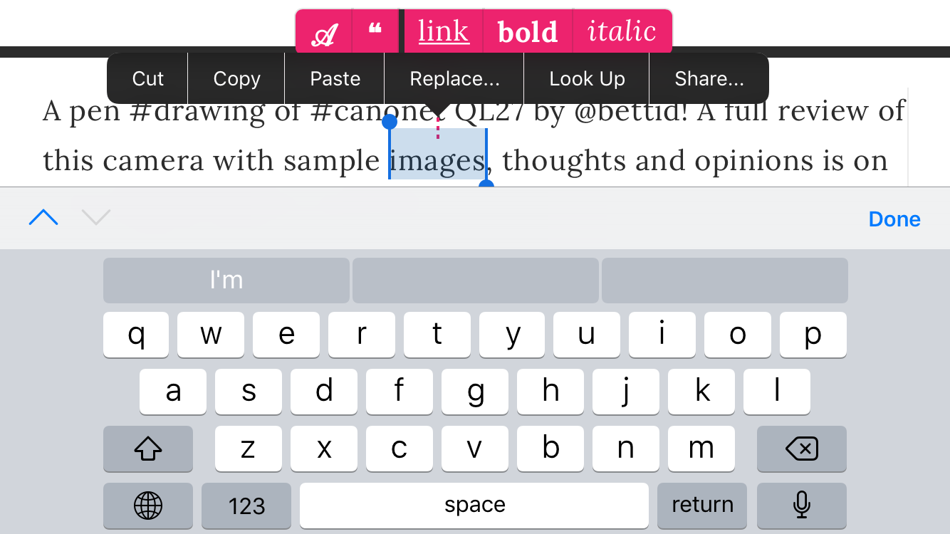
- Mobile-ready. Even for iOS: there's a cleverly-designed format menu that works with iPhone and iPad. Android devices may still have bugs though.
- Built to make it easy for you to create an experience that will mirror the final published article for your users, so that they don't have to click Preview button every time.
-
french-press-editoris a ready-made, opinionated package, yet there is plenty that you can customize, far beyond CSS.
-
Paragraph: the default, rendered as
<p></p>. -
Heading: there is only one level of heading, which is rendered as
<h3></h3>to allow for semantic HTML structure in a document that has a title<h1></h1>and a subtitle<h2></h2>. Headings do not allow any formatting (links, bold, italic) within in order to maintain clean content structure. -
Quote: rendered as
<blockquote></blockquote>. Quotes do not allow any formatting (links, bold, italic) within in order to maintain clean content structure. Quotes also do not allow images or any other blocks within to keep the documents clean and to-the-point. -
Link: rendered as
<Link></Link>usingreact-link-filtercomponent built on top of React Router 4 with additional features, such as correcting user input (if they forgot to type http://), transforming absolute URLs on your domain to relative ones, and a proper function within React application that works in React Router 4 context. -
Divider: rendered as
<hr />. -
Image: this is a pluggable component that renders
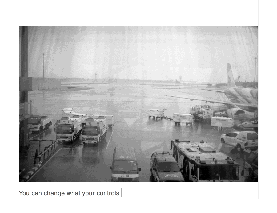
<Picture />. With this package there is a ready-made component that you can use, which will properly render images in your document. You may, however, develop your own image components with a lot more options (such as different sizes, positions, captions etc.) - Docket: this is a pluggable component that you can provide (there's none by default) that can display your component inside editor when the user clicks "Insert Image" button. A use case for something like this is giving user image suggestions before asking them to upload an image.
- Placeholder text: you can define grey text that users see on an empty document.
-
Bold: rendered as
<strong></strong>. -
Italic: rendered as
<em></em>.
- Floating edit menu: à la Medium. When user selects text a menu just above the highlighted area appears with options to convert text block into a heading, convert text block into a quote, add link to selected text, make selected text bold, make selected text italic.
- Unquote button: appears within the quote when user's carriage is inside of it.
- Undo heading button: appears just above the highlighted area of a heading when it's selected by user.
- Insert image button: shows up every time the user is on a new empty paragraph block.
- Drag & drop image: user can drag and drop image into the editor.
-
Keyboard shortcuts:
- ⌘+k will make a link out of selected text.
- ⌘+b will make selected text bold.
- ⌘+i will make selected text italic.
- Typing
***on a new line and pressing Enter will create a divider line. - Typing
#followed by space and text will convert paragraph into a heading after user moves to the next line with Enter key. - Typing
>followed by space and text will convert paragraph into a quote after user moves to the next line with Enter key. - Hitting Backspace when the carriage is at the start of a heading or a quote will undo heading or quote.
- Typing
...and pressing space will convert three dots into an ellipsis…. - Typing space then dash
-then space again will turn dash into—(—). - Double and single quotes are smart.
- After user is hits Enter key within a heading a period will be added at the end of it if there are no other punctuation marks present at the end (for correct & consistent formatting).
- If the last element in the document is an image, an empty new line will follow so that the user has an easy way to continue adding content.
- If the user pastes HTML form another web page or document, it will be converted and interpreted to follow the structure outlined in "content block types" and "text format options" above.
-
callbackStatus()will send you "ok" or "pending" indicating whether the content is being stored in browser or not. -
callbackError()will send you error string and reason (i.e. if the image is too large).
-
editorRef()returns Slate Editor reference once it mounts.
If you have a feature request, bug report or a question, please submit an issue. Please keep in mind that this tool isn't built for everyone and it works best when there are less features cluttering the experience and weighing down the package.
Pull requests are very much welcome. To get started with the code: clone the repo, run yarn install then yarn dev and open up http://localhost:3002 in your browser.
Every folder in this repo has a README.md file to help you along.