
Angular Form.io Editor Component


This Angular component provides Form.io builder and renderer integrated with json editor.
It works with latest Angular 9.
Example:
<formio-editor [form]="form" [options]="options"></formio-editor>Try the Live Demos: Demo Dev and Demo Stable
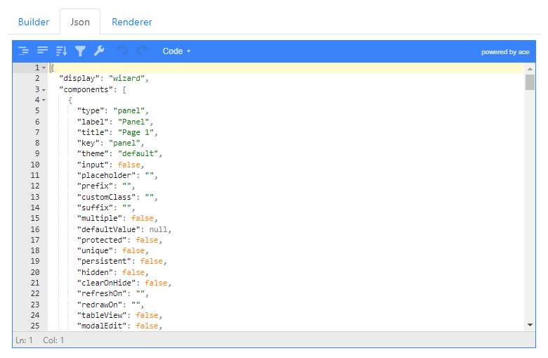
In case the live demo goes down for whatever reason, the component is supposed to look somewhat like this (click any image to enlarge it):
 |
 |
 |
 |
Installation
To install this library with npm, run below command:
$ npm install --save angular-formio jsoneditor ngx-bootstrap @angular/elements @davebaol/angular-formio-editor
Yes, you have to install 5 packages!!!
Having in mind the dependency graph can be useful for choosing the version of the various packages for your application.
Peer dependency graph 👈

Usage
To use this component in your Angular application follow the steps below:
FormioEditorModule as below:
import { FormioEditorModule } from '@davebaol/angular-formio-editor';

@NgModule({
  declarations: [
    AppComponent
  ],
  imports: [
    ....,
    FormioEditorModule
  ],
  providers: [],
  bootstrap: [AppComponent]
})
export class AppModule { }import { Component } from '@angular/core';
import { FormioEditorOptions } from '@davebaol/angular-formio-editor';
@Component({
selector: 'app-root',
template: `
<div class="content" role="main">
<div class="col-10 m-4">
<formio-editor [form]="form" [options]="options"></formio-editor>
</div>
</div>
`,
styleUrls: ['./app.component.css']
})
export class AppComponent {
form: any;
options: FormioEditorOptions;
constructor() {
this.form = {
display: 'form',
components: []
};
this.options = {
builder: {
hideDisplaySelect: true,
output: {
change: (event) => console.log('Demo: builder change event:', event),
}
},
json: {
changePanelLocations: ['top', 'bottom'],
input: {
options: {
modes: ['code', 'tree', 'view'], // set allowed modes
mode: 'view' // set default mode
}
}
},
renderer: {
input: {
options: {
src: 'http://localhost:8765/api/v1/documents',
renderOptions: { breadcrumbSettings: { clickable: true } }
}
}
}
};
}
}@import "./styles/bootstrap/css/bootstrap.min.css";
@import '~font-awesome/css/font-awesome.min.css';
@import "~jsoneditor/dist/jsoneditor.min.css";
@import "~@davebaol/angular-formio-editor/styles.css";Note that this library only needs the .css from bootstrap, not the .js, since ngx-bootstrap is used internally.
So you don't have necessarily to add bootstrap and its peer dependency jQuery.
- If during
ng buildexecution you encounter this error
make sure you're using node 12+. If this does not work for you then try the other possible solutions mentioned here.Generating ES5 bundles for differential loading... An unhandled exception occurred: Call retries were exceeded
Documentation
The component supports the input arguments form, options and reset described below:
-
form
This is a regular form defined by the form.io framework. The component modifies this argument in place. -
options
The options have 3 properties, one for each tab of the component:builder,json,renderer. Open the spoilers to see the details.-
options.builder
👈 { // Whether to hide the builder tab or not. Defaults to false. hideTab: false, // Specify if the builder is the active tab at component startup. Defaults to true. defaultTab: true, // Whether to hide or not the embedded select to change the form display. Defaults to false. hideDisplaySelect: false, // Input and output arguments of the component <formio-builder>. // Refer to the official documentation. input: {}, output: {} }
-
options.json
👈 { // Whether to hide the json tab or not. Defaults to false. hideTab: false, // Specify if json is the active tab at component startup. Defaults to false. defaultTab: false, // The locations relative to the json editor where to show the panel // for applying json changes to the form. Defaults to ['top', 'bottom']. changePanelLocations: ['top', 'bottom'], // Input arguments of the component <json-editor>. input: { // Note that these options are only intended as a component setup at creation-time. options: { // Whether to expand or not all nodes in tree mode. This is an additional option // not supported by the original jsoneditor. Defaults to false. expandAll: false, // Other options supported by the original jsoneditor. // See jsoneditor API documentation at the link below // https://github.com/josdejong/jsoneditor/blob/master/docs/api.md#configuration-options ... } }, // Output arguments of the component <json-editor>. output: { dataChange: (event: any) => {} dataError: (event: any) => {} } }
-
options.renderer
👈 { // Whether to hide the renderer tab or not. Defaults to false. hideTab: false, // Specify if renderer is the active tab at component startup. Defaults to false. defaultTab: false, // Configuration of the submission panel. submissionPanel: { // Whether to show the submission panel or not. Default to false. disabled: false, // Whether to initially show full or partial submission. Default to false. fullSubmission: false, // The json editor of the submitted resource. resourceJsonEditor: { // Input and output arguments of this component <json-editor>. // See options.json.input and options.json.output above. input: {}, output: {} }, // The json editor of the json schema for the submitted resource schemaJsonEditor: { // Whether to show or not the schema json editor. Defaults to false. enabled: true, // Input and output arguments of this component <json-editor>. // See options.json.input and options.json.output above. input: {}, output: {} } } }, // Input and output arguments of the component <formio> that renders the form. // Refer to the official documentation. input: {}, output: {} }
-
-
reset
AnObservable<void>to reset the component.
License
This project is licensed under the MIT License - see the LICENSE file for details.