


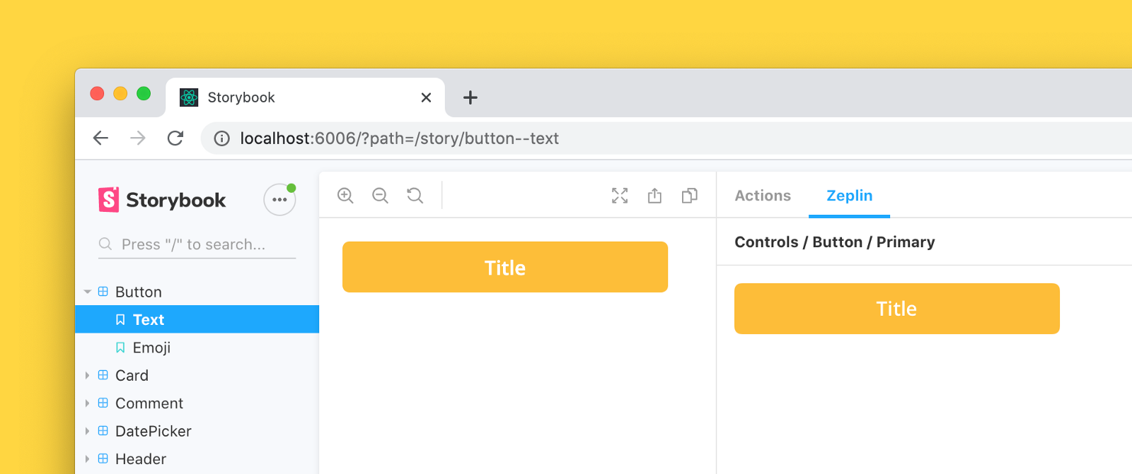
Storybook addon that embeds Zeplin resources such as screens and components in the addon panel for better design-development workflow.
- Storybook@>=5.0.0
This addon should work with any framework. If you find a case that the addon does not work, please open an issue.
npm install --save-dev storybook-zeplin
# yarn add -D storybook-zeplin// .storybook/main.js
module.exports = {
addons: ["storybook-zeplin/register"],
};If you're using Storybook@5.0.x;
// .storybook/addons.js
import "storybook-zeplin/register";There are two ways to do this, you can link your entire Zeplin project or styleguide to your global story parameters (recommended) or link individual components one by one.
Add zeplinLink to .storybook/preview.js file. This value is a link to the project or styleguide that contains correspondent designs in Zeplin as shown below examples.
When this parameter is provided, you will automatically view Zeplin components linked to your stories on the addon panel using the Storybook integration.
Using a Zeplin web link
//.storybook/preview.js
export const parameters = {
    zeplinLink: "https://app.zeplin.io/project/5e7a6d478204d59183a1c76b",
};
Using a Zeplin app link
//.storybook/preview.js
export const parameters = {
    zeplinLink: "zpl://project?pid=61f164b064e363a52fbb295f",
};
When the addon setup is done, go and check out below articles to learn more about how to initialize Storybook integration on Zeplin.
- Connecting your Storybook instance with Zeplin
- Linking your components in Zeplin with stories in Storybook.
Storybook Zeplin takes parameter zeplinLink as an array of elements containing a name and a link or just a string for the link.
For the link, you can use full web URL or app URI of Zeplin components/screens.
Example of adding Zeplin link to all stories in a file:
export default {
    title: "Button",
    component: Button,
    parameters: {
        zeplinLink: "https://app.zeplin.io/project/5e7a6d478204d59183a1c76b/styleguide/components?coid=5eac833c5f1f2f1cb19f4f19",
    },
};

export const Default = () => <Button>Click me</Button>;
export const Secondary = () => <Button secondary>Click me</Button>;

Default.story = {
    name: "Primary Button",
};

Secondary.story = {
    name: "Secondary Button",
};
Example of adding multiple Zeplin links to a story:
export default {
    title: "Button",
    component: Button,
};

export const Default = () => <Button>Click me</Button>;
export const Secondary = () => <Button secondary>Click me</Button>;

Default.story = {
    name: "Responsive Button",
    parameters: {
        zeplinLink: [
            {
                name: "Desktop",
                link: "zpl://components?pid=pid1&coid=coid1",
            },
            {
                name: "Tablet",
                link: "zpl://components?pid=pid1&coid=coid2",
            },
            {
                name: "Mobile",
                link: "zpl://components?pid=pid1&coid=coid3",
            },
        ],
    },
};To access your Zeplin resources, you need to provide an access token with your Zeplin account permissions. You can create one from Developer tab in your profile page.
The addon prompts to set the token when you open the addon's tab. This token is kept in the browser storage, so each user needs to create and set their own token to access Zeplin resources via Storybook.

If you want to skip creating tokens for each user,
you can provide the access token as an environment variable called STORYBOOK_ZEPLIN_TOKEN.
You can create .env file in your project's root folder, or you can provide the environment variable as a command line parameter when building or dynamically running Storybook.
Please note that access token can be viewed by anyone with access to the Storybook instance if you set it using environment variable. For security reasons, never use the environment variable, if the Storybook instance can be accessed by 3rd parties.
# .env
STORYBOOK_ZEPLIN_TOKEN="eyJhbGciOiJIUzI1N.."Run following commands in separate tabs to start development
npm run watch
npm run storybook- This addon extracts the Storybook data and sends to parent frame to make stories reachable from Zeplin apps. For more information: Zeplin Storybook integration
MIT © Mert Kahyaoğlu