
rn-componenets
A simple set of dependency free* components for React Native.
This repo is a location for my shared components that I use across my personal projects. Some of these components are more mature than others. I implement as many features as I need to accomplish my goals. If there is a feature missing please feel free to submit a pull request and I will gladly merge it in.
*The only dependency is react-native.
Install and usage
yarn
yarn add rn-componentsnpm
npm i rn-components -SComponents are separate atomic classes. I take care to prevent interdependencies between the controls. This may cause some code duplication but I feel the independence of each component is far more valuable than a large monolithic heavily interdependant library. Because of this approach you can include only the components you need.
Components Included
Material Inspired
These components are inspired by Material Design and Material UI. They provide clean, simple, and lightweight implementations that have a default useable styling. Out of the box these components can be used to put together a Material inspired UI without the need for lengthy initializers and style object.
MaterialModal
Animates a flat modal dialog with a title and content area.
See the Full Example here.
import MaterialModal from 'rn-components/material/Modal'; <MaterialModal title="Example" modalVisible={this.state.modalVisible} onClosed={() => this.setState({modalVisible: false})} > <Text>This is just a simple example of using the modal.</Text></MaterialModal>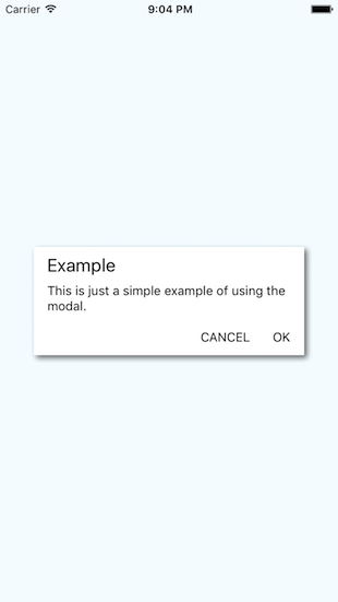
LineTextInput
Very simple implementation of a flat text input that has an animated line that draws under the control when the control is given focus. When focus is lost the line disappears.
See the Full Example here.
import LineTextInput from 'rn-components/material/LineTextInput'; <LineTextInput placeholder="placeholder text" onChangeText={(text) => console.log('LineTextInput new value:', text)} />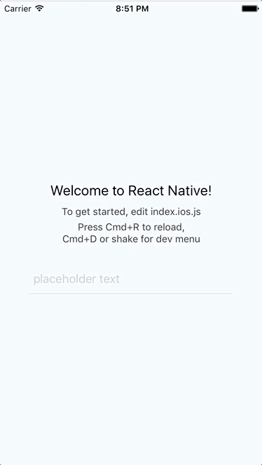
ShadowTextInput
Super simple Text Input that casts a shadow. This input is made to look similar to the search boxes that Google implements in some of it's UI. Sure, this could just be a style.
See the Full Example here.
import MaterialShadowTextInput from 'rn-components/material/ShadowTextInput'; <MaterialShadowTextInput placeholder="placeholder text" onChangeText={(text) => console.log('LineTextInput new value:', text)} />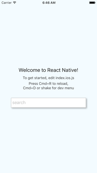
FloatingActionButton
Wicked simple implementation of a floating action button. By default the button is styled to match a Material FAB and is placed in the bottom right corner of the screen. Out of the box you just need to subscribe to the onPress callback and optionally drop some child controls in it. By default the child controls are centered in the middle of the circle.
See the Full Example here.
import FloatingActionButton from 'rn-components/material/FloatingActionButton'; <FloatingActionButton onPress={() => console.log('FAB Pressed.')}/>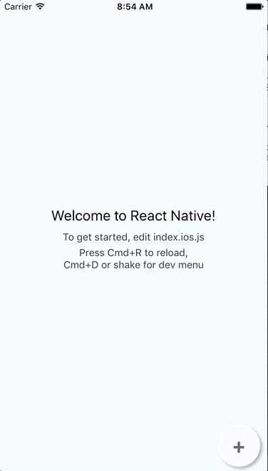
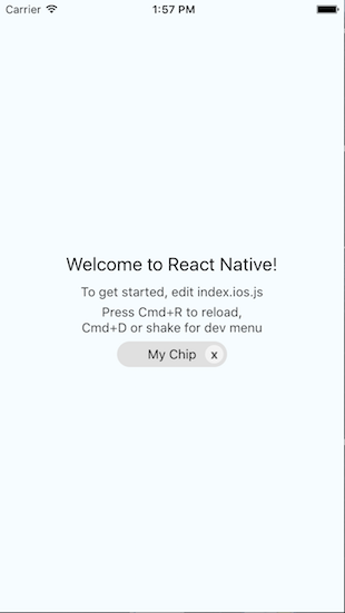
Chip
Implements a chip that has a delete button. Also referred to as a tag.
See the Full Example here.
import Chip from 'rn-components/general/Chip'; <Chip title="My Chip" containerStyle={{width: 120}} />