React Theme Provider
https://github.com/sm-react/react-theme-provider
What is React Theme Provider?
A generic theme provider and (very) simple CSS styler
now it is under development, see live demo, and this README
Use React Theme Provider in follow cases:
if you don't use Material-UI:
- Provide the
theme datato your React Components viacontext. You don't need to have Material-UI in dependencies if you just want to pass your created theme to your non Material-UI components. - Add style to your
htmlelements - it will be based on your theme settings. - Switch your created themes via API.
if you use Material-UI:
- Add simple style to you non material
htmlelements. They will have same appearance with the marerial ones if wrapped in this provider. - Override some part of your app with another theme.
- Have an API to switch themes on the client side.
What is Theme?
It's just plain javascript object, typically with two levels of nesting.
Primer:
const greyTheme = {
    themeName: 'Grey Theme',
    themeFile: 'greyTheme.json',
    palette: {
        primary1Color: '#00bcd4',
        alternateTextColor: '#4a4a4a',
        canvasColor: '#616161',
        textColor: '#bdbdbd',
        secondaryTextColor: 'rgba(255, 255, 255, 0.54)',
        disabledColor: '#757575',
        accent1Color: '#607d8b',
    },
};
You can develop your own themes with this tool (or see Live Demo)
What is CSSrule?
a string containing CSS rules. Typically it's a template string with passed theme props:
.themed div {
    color: ${palette.textColor};
    background-color: ${palette.canvasColor};
}

.themed a {
    color: ${palette.primary1Color};
}
Demo
Explore this live demo project:
API
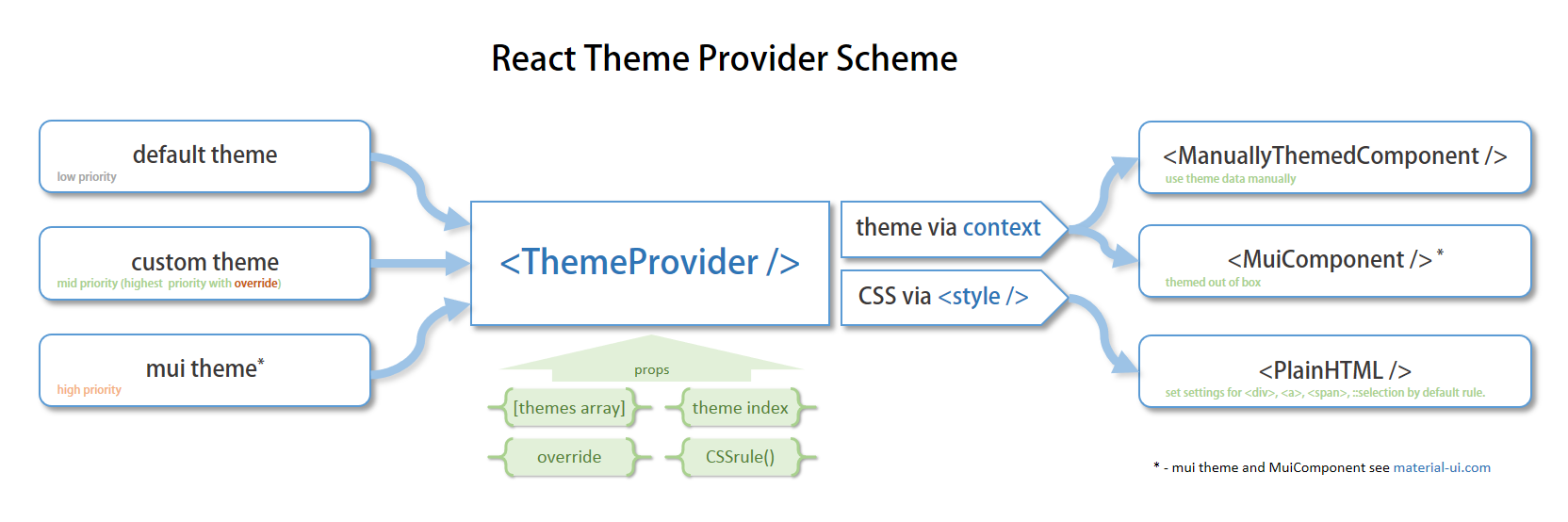
<ThemeProvider
  themes={[greyTheme, altTheme]}
  themeInd={1}
  override
  setCSS={CSSrule}
>
  <ThemedComponent />
</ThemeProvider>
themes - array with themes created in storybook-addon-material-ui. not required
themeInd - to set the current theme from themes. not required
override - if you use it inside of MuiThemeProvider (Material-UI) it will override theme. not required
setCSS - your custom CSS style function. You can set your own rules for CSS styling based on the theme setting. not required
if you use it without any props inside the
MuiThemeProvider, it will provide CSS style for yourhtmlelements based on the current theme
if you use it without any props outside the
MuiThemeProvider, it will provide CSS style for yourhtmlelements based on the default theme and pass this theme to your components via context same way asMuiThemeProvider.
by default you will have follow CSS settings:
.${className} div { color: ${palette.textColor}; background-color: ${palette.canvasColor}; border-width: 1px; border-color: ${palette.borderColor};} .${className} a { color: ${palette.primary1Color};} .${className} span { color: ${palette.accent1Color};} .${className} ::selection { background: ${palette.primary2Color};} Usage
- install
npm i react-theme-provider --save
- import
import ThemeProvider from 'react-theme-provider';
- wrap
<ThemeProvider>
  <YourThemedComponentOrPlainHTML />
</ThemeProvider>
more examples see in