React Native Material Design Dialog
Description
Make beautiful material design dialogs for both Android and IOS with lots of configurations to suit your need
Installation
$ npm install react-native-md-dialog --save
Try with Exponent

Screenshots
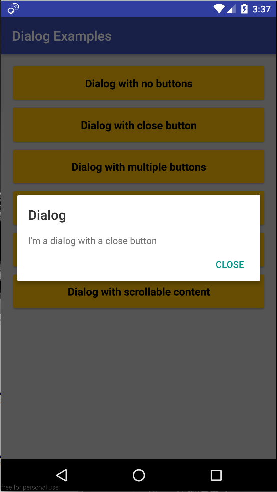
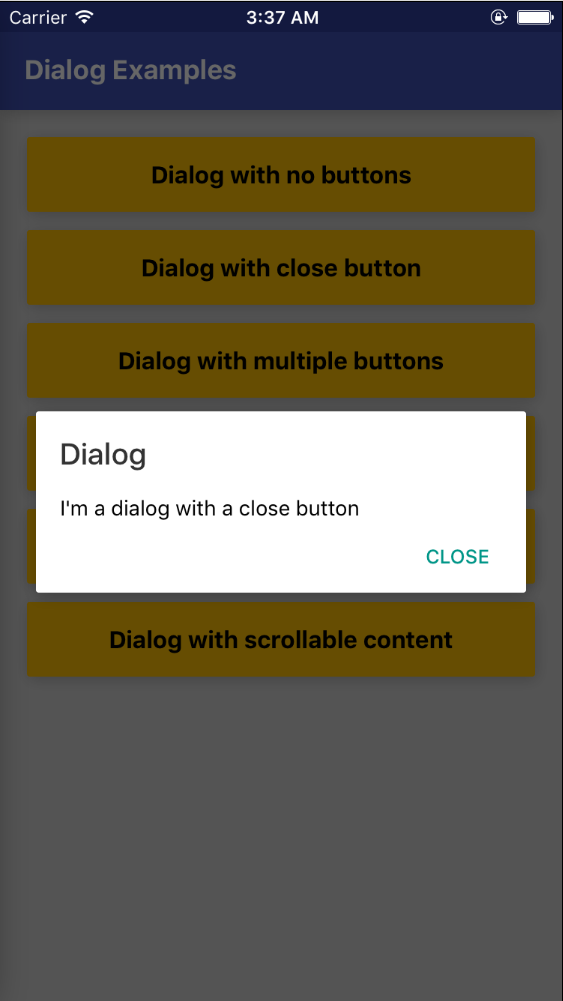
One Button Dialog
| Android |
IOS |
 |
 |
Code
import Dialog, {
DialogButton
} from 'react-native-md-dialog';
...
<Dialog actions={[<DialogButton text='CLOSE' onPress={() => this.refs.dialog.close()} position='right'/>]} ref='dialog'>
<View style={styles.dialogConatiner}>
<Text >
I'm a dialog with a close button
</Text>
</View>
</Dialog>
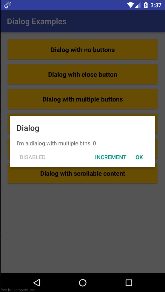
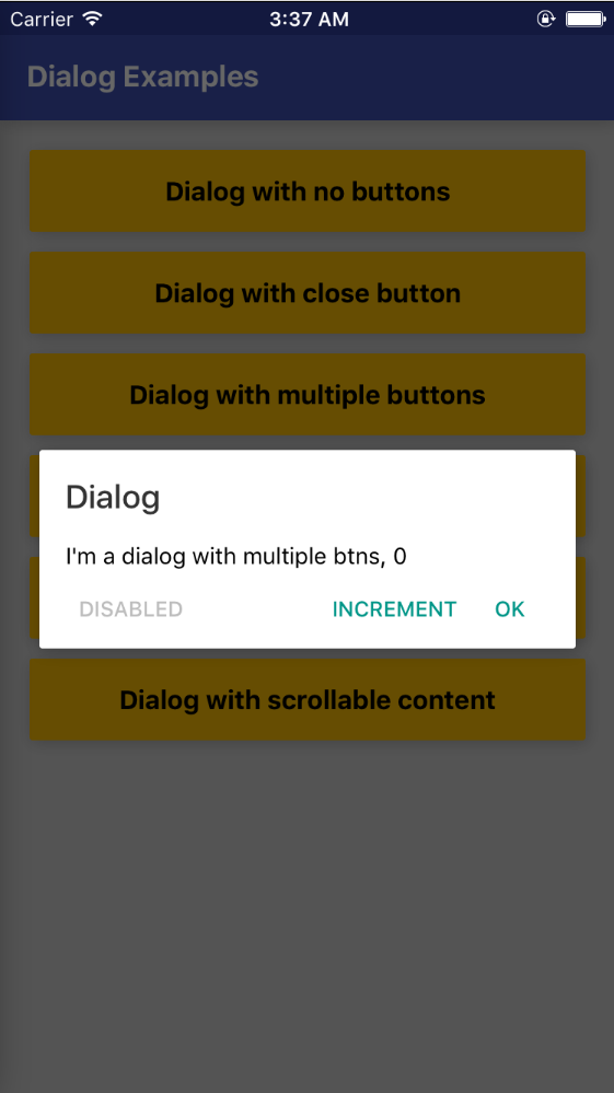
Multiple Buttons Dialog
| Android |
IOS |
 |
 |
Code
import Dialog, {
DialogButton
} from 'react-native-md-dialog';
...
<Dialog
actions={[
<DialogButton text='INCREMENT' onPress={() => this.setState({ numberOfClicks: this.state.numberOfClicks + 1})}/>,
<DialogButton text='OK' onPress={() => this.refs.dialog.close()}/>,
<DialogButton text='DISABLED' disabled={true} position='left' />
]}
ref='dialog'>
<View style={styles.dialogConatiner}>
<Text >
I'm a dialog with multiple btns, {this.state.numberOfClicks}
</Text>
</View>
</Dialog>
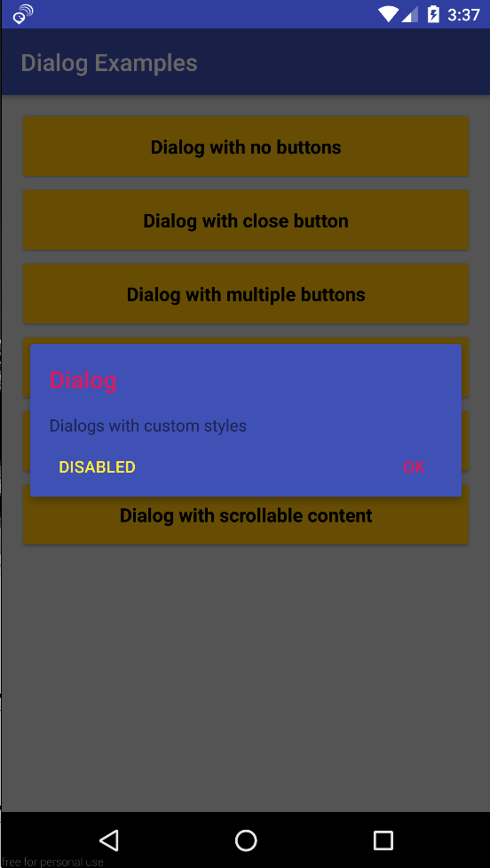
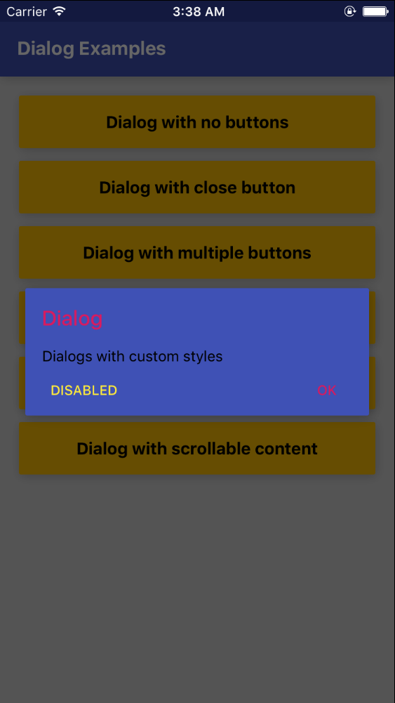
Styles Dialog
| Android |
IOS |
 |
 |
Code
import Dialog, {
DialogButton
} from 'react-native-md-dialog';
...
<Dialog
backgroundColor='#3f51b5'
titleColor='#d81b60'
actions={[
<DialogButton text='DISABLED' disabled={true} position='left' color='#ffeb3b' />,
<DialogButton text='OK' onPress={() => this.refs.dialog.close()} color='#d81b60'/>
]}
ref='dialog'>
<View style={styles.dialogConatiner}>
<Text>Dialogs with custom styles</Text>
</View>
</Dialog>
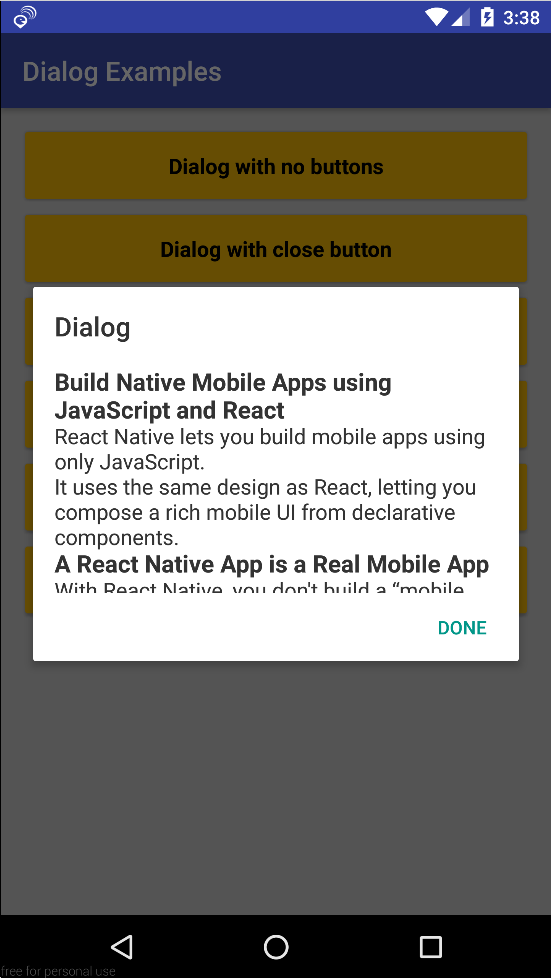
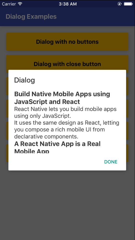
Scrollable Content Dialog
| Android |
IOS |
 |
 |
Code
import Dialog, {
DialogButton
} from 'react-native-md-dialog';
...
<Dialog
actions={[
<DialogButton text='DONE' onPress={() => this.refs.dialog.close()} />
]}
ref='dialog'
maxHeight={280}>
<ScrollView>
<View style={styles.dialogConatiner}>
<Text style={{ color: 'rgba(0,0,0,0.8)', fontSize: 16 }}>
...
</Text>
</View>
</ScrollView>
</Dialog>
<Dialog/> props
| Prop |
Description |
Type |
Default |
| actions |
Array of <DialogButton/> components |
PropTypes.array |
None |
| style |
React Native style object |
PropTypes.object || PropTypes.array |
None |
| title |
Dialog's tilte. |
PropTypes.string |
Dialog |
| titleColor |
Color of dialog's tilte. |
PropTypes.string |
rgba(0,0,0,0.8) |
| backgroundColor |
Dialog's background color. |
PropTypes.string |
white |
| dismissable |
Determines if clicking outside the dialog closes the dialog or not. |
PropTypes.bool |
false |
| animationDuration |
Duration of closing and opening the dialog. |
PropTypes.number |
200 |
| width |
Dialog's width. |
PropTypes.number |
deviceWidth - 48 |
| maxHeight |
Dialog's max height. |
PropTypes.number |
420 |
<DialogButton/> props
| Prop |
Description |
Type |
Default |
| text |
Button's text |
PropTypes.string |
None |
| disabled |
Determines whether the button is enabled or not |
PropTypes.bool |
false |
| onPress |
Determines the action when button is pressed |
PropTypes.func |
None |
| color |
Text color of the button |
PropTypes.string |
#009688 |
| position |
Determines where to put the button |
PropTypes.string |
right |
Dialog's methods
| Name |
Description |
open() |
Opens the dialog |
close() |
Closes the dialog |