
react-comparison-slider
https://react-comparison-slider.vercel.app/
React Comparison Slider is a fully customizable component for building bespoke, keyboard-accessible "before & after" sliders for the web. You bring the content and the visuals, and it'll handle the heavy lifting.
Installation
yarn add react-comparison-slider
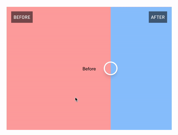
The "Hello World" example
The key ingredients to this component are:
-
aspectRatio, expressed either numerically as a fraction (e.g.,16/9), or as a string (e.g.,"16x9"or"16:9"). Providing an aspect ratio ensures that the before and after "images" (or HTML elements, whatever you decide to provide) line up with one another. -
itemOneof typeReact.ReactNodeor function as a child({value}) => React.ReactNode -
itemTwoof typeReact.ReactNode({value}) => React.ReactNode -
defaultValue, if you'd like to use the component in an uncontrolled fashion -
orientation, where you can pass eitherverticalorhorizontal. Horizontal sliders are the default.
import { ComparisonSlider } from 'react-comparison-slider';

export const HelloWorldExample = () => {
  return (
    <ComparisonSlider
      defaultValue={50}
      itemOne={<div className="bg-red-200"></div>}
      itemTwo={<div className="bg-blue-200"></div>}
      aspectRatio={16 / 9}
      orientation="horizontal"
    />
  );
};
Customization
React Comparison Slider does ship with some very lightweight styling, but encourages you to bring your own styling (BYOS)
// For adding a "bar" below the handle (or to the left, if in "vertical" orientation)
handleBefore?: React.ReactNode;

// For adding a "bar" below the handle (or to the right, if in "vertical" orientation)
handleAfter?: React.ReactNode;

// For customizing the slider handle itself. Note that `ComparisonSliderHandleProps` exposes an `isFocused` prop that you can use to style the handle when it has keyboard focus.
handle?: (props: ComparisonSliderHandleProps) => React.ReactNode;
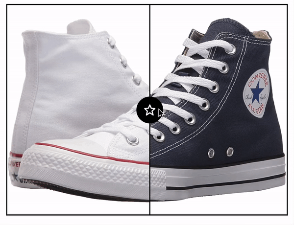
handleBefore and handleAfter
These props allows you to add visual indicators such as a scrubbing bar to the slider handle itself. In the example below, we add a thin white bar above and below the handle as shown in the screenshot below.
import { ComparisonSlider } from 'react-comparison-slider';

export const CustomHandleDecorations = () => {
  return (
    <ComparisonSlider
      defaultValue={50}
      itemOne={<div className="bg-red"></div>}
      itemTwo={<div className="bg-blue"></div>}
      aspectRatio={16 / 9}
      handleBefore={
        <div className="bg-gradient-to-t from-white to-transparent w-2 h-full"></div>
      }
      handleAfter={
        <div className="bg-gradient-to-b from-white to-transparent w-2 h-full"></div>
      }
      handle={({ isFocused }) => {
        return (
          <div
            className={cc([
              'rounded-full w-8 h-8 bg-white',
              { ring: isFocused },
            ])}
          ></div>
        );
      }}
    />
  );
};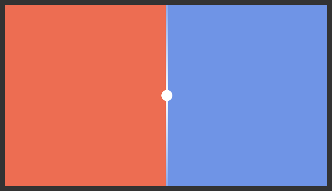
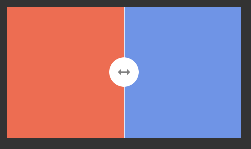
handle
Of course, you can fully style the handle itself. You can make it bigger, add an icon, add fancy shadows...
import { ComparisonSlider } from 'react-comparison-slider';

export const CustomHandle = () => {
  return (
    <ComparisonSlider
      defaultValue={50}
      itemOne={<div className="bg-red"></div>}
      itemTwo={<div className="bg-blue"></div>}
      aspectRatio={16 / 9}
      handle={({ isFocused }) => {
        return (
          <div
            className={cc([
              'rounded-full w-10 h-10 bg-white text-graty-600 flex items-center justify-center',
              { ring: isFocused },
            ])}
          >
            <BiMoveHorizontal size={24} />
          </div>
        );
      }}
    />
  );
};
The API
Below is a high-level interface definition for the component. Note that because this component can be used in both a controlled and uncontrolled fashion, the first three props – value, defaultValue, and onChange are actually totally dynamic. That is to say, if you provide a defaultValue you won't be asked for value or onChange. In fact, you'll get a compilation error if you try to use them. Conversely, if you provide value and onChange, you won't be asked for defaultValue and will error out accordingly if you provide it.
value?: number;
onValueChange?: (value: number) => void;
defaultValue?: number;

// The "first" item in the viewport.
itemOne:
    | React.ReactNode
    | (({ value }: { value: number }) => React.ReactNode);

// The "second" item in the viewport.
itemTwo:
  | React.ReactNode
  | (({ value }: { value: number }) => React.ReactNode);

// The...aspect ratio.
aspectRatio: number | string;

// Decoration that appears above (or to the left of, depending on orientation) the handle.
handleBefore?: React.ReactNode;

// Decoration that appears below (or to the bottom of, depending on orientation) the handle.
handleAfter?: React.ReactNode;

// Handle component
handle?: (props: ComparisonSliderHandleProps) => React.ReactNode;

// Whether the slider is vertical or horizontal 😋
orientation?: 'vertical' | 'horizontal';

// Whether only the handle itself should be interactive
onlyHandleDraggable?: boolean;