
Description
Angular directive to impose Angular Material based loading indicator on any content. The loading indicator may be an indeterminate Angular Material progress spinner or a progress bar.

- Compatible with Angular Material components such as input, select, etc.
- Uses Angular Material Theme colors.
- Well configurable.
- Works well in SSR mode.
Demo
 Also you can clone the repo and start the application locally to see ng-material-loading lib in action.
Usage
Install package
npm i ng-material-loadingAdd import to your module
import { NgMaterialLoadingModule } from 'ng-material-loading';

@NgModule({
  imports: [
    ...
    NgMaterialLoadingModule.forRoot(),
    ],
  declarations: [],
  providers: []
})
Then in template:
  <mat-form-field [ngMatLoading]="loading$ | async" ngMatLoadingType="progress">
    <input matInput/>
  </mat-form-field>
or
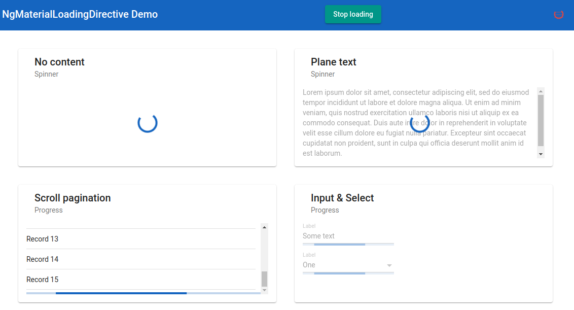
  <mat-card>
    <mat-card-header>
      <mat-card-title>Plane text</mat-card-title>
      <mat-card-subtitle>Spinner</mat-card-subtitle>
    </mat-card-header>

    <mat-card-content [ngMatLoading]="loading$ | async">
      <p>Lorem ipsum dolor sit amet...</p>
    </mat-card-content>
  </mat-card>
Options
| Option | Type | Default | Description |
|---|---|---|---|
| ngMatLoadingContentOpacity | number | 0.3 | Content opacity when the loading indicator is imposed |
| ngMatLoadingDiameter | number | 40 | Spinner diameter in pixels |
| ngMatLoadingColor | 'primary', 'warn', 'accent' | 'primary' | Loading indicator color |
| ngMatLoadingType | 'spinner', 'progress' | 'spinner' | Time to close after a user hovers over toast |
| ngMatLoadingAttacheTo | string | null | Selector of HTML element to which the loadinf indicator should be attached |
| ngMatLoadingFreeze | boolean | true | Whether to make content inactive while loading |
| ngMatLoadingPosition | 'absolute', 'relative', 'sticky' | Depends on loading indicator type | Loading indicator CSS position |
Configuration
You can configure default ng-material-loading options:
NgMaterialLoadingModule.forRoot({
  opacity: 0.45,
  type: 'progress',
  ...
})
The configuration interface looks like this:
export interface NgMatLoadingConfig {
  opacity?: number; // Content opacity when the loading indicator is imposed
  diameter?: number; // Spinner diameter in pixels
  color?: 'primary' | 'warn' | 'accent'; //Loading indicator color
  type?: 'spinner' | 'progress'; // Loading indicator type
  attacheTo?: { [key: string]: string; } // host to target map (see below)
  freeze?: boolean; // Whether to make content inactive while loading
  position?: 'absolute' | 'relative' | 'sticky' // Loading indicator CSS position
}
In attacheTo object you can list selector to which loading indicator should be attached for some commonly encountered host elements.
The positionconfig option, if not set, depends on loading idicator type. For spinner position is absolute while for progress bar position is sticky by default.
Contributig to ng-material-loading
You are more than welcome to improve this library or create issues on the GitHub issue tracker.