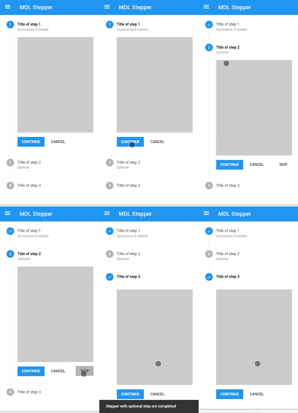
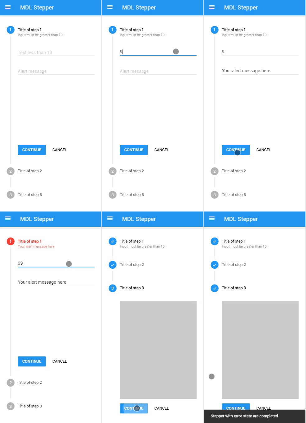
A library that implements to the Material Design Lite a polyfill of stepper component specified by Material Design. The stepper polyfill will help you to implement this material design component today.
axdemelas.github.io/mdl-stepper
The MDL Stepper component was based on Material Design Lite (MDL) library. To use this component before you will need to include the MDL to your project.
You can download the current version of repository compacted.
# Clone the repository.
git clone git@github.com:axdemelas/mdl-stepper.git
# Access created folder.
cd mdl-stepper
Goes to development section for details.
npm install --save mdl-stepperbower install mdl-stepper-
Choose the type of download and include the Material Design Lite files to your all pages.
-
Get the CSS & Javascript files of MDL Stepper component.
-
Include the Material Design Lite + Stepper files.
<!-- Material Design Lite CSS -->
<link rel="stylesheet" href="https://code.getmdl.io/1.1.3/material.blue-pink.min.css" />
<!-- MDL Stepper CSS -->
<link rel="stylesheet" href="./stepper.min.css">
<!-- Material Icons -->
<link rel="stylesheet" href="https://fonts.googleapis.com/icon?family=Material+Icons">Note: Make sure that you are loading the javascripts in the correct order.
<!-- Material Design Lite JS -->
<script defer src="https://code.getmdl.io/1.1.3/material.min.js"></script>
<!-- MDL Component JS -->
<script defer src="./stepper.min.js"></script>
<script>
  (function () {
    window.addEventListener('load', function () {
      // Your custom code in "onload" callback.
    });
  })();
</script>// Select your stepper element.
var stepperElement = document.querySelector('ul.mdl-stepper');
// Get the instance of componet for control over API.
var Stepper = stepperElement.MaterialStepper;
// Goes to the next step.
Stepper.next();The types of steppers and steps are specified in Material Design page.
Linear steppers require users to complete one step in order to move on to the next. (Material Design)
Non-linear steppers allow users to enter a multi-step flow at any point. (Material Design)
Steppers may display a transient feedback message after a step is saved. Stepper feedback should only be used if there is a long latency between steps. (Material Design)
Editable steps allow users to return later to edit a step. These are ideal for workflows that involve editing steps within a session. (Material Design)
Optional steps within a linear flow should be marked as optional. (Material Design)
"Steppers display progress through a sequence by breaking it up into multiple logical and numbered steps. Avoid using steppers to break up sections in a short form, or multiple times on one page". Goes to Material Design spec page.
See component markup details.
| Class | Effect | Remarks |
|---|---|---|
mdl-stepper |
Defines a stepper container. | Required |
mdl-stepper--linear |
Defines the stepper as linear and require users to complete one step in order to move on to the next. | Manually added |
mdl-stepper--horizontal |
Defines the stepper as horizontal type, the step name and numbers appear on a horizontal bar. | Manually added |
mdl-stepper--feedback |
Display a transient feedback message after a step is saved. | Manually added |
mdl-step |
Defines a step item inside mdl-stepper. |
Required |
is-active |
Defines the active step. The first step will be marked as active if you don't set it. | Manually added |
mdl-step--optional |
Defines a step as optional. | Manually added |
mdl-step--editable |
Defines a step as editable after saved. | Manually added |
mdl-step__label |
Defines the label section of step. | Required |
mdl-step__title |
Defines title part of label. Must be inside a mdl-step__label. |
Required |
mdl-step__title-text |
Defines the text content of title. Must be inside a mdl-step__title. |
Required |
mdl-step__title-message |
Defines an addtional text to the title (e.g. Optional). Must be inside a mdl-step__title. |
Manually added |
mdl-step__content |
Defines the content section of step. | Required |
mdl-step__actions |
Defines the actions section of step | Required |
Methods and custom events to the control over Stepper instance.
| Method | Effect | Return |
|---|---|---|
MaterialStepper.next() |
Complete the current step and move one to the next. Using this method on editable steps (in linear stepper) it will search by the next step without "completed" state to move. When invoked it dispatch the event onstepcomplete to the step element. |
boolean - True if move and false if not move (e.g. On the last step) |
MaterialStepper.back() |
Move to the previous step without change the state of current step. Using this method in linear stepper it will check if previous step is editable to move. |
boolean - True if move and false if not move (e.g. On the first step) |
MaterialStepper.skip() |
Move to the next step without change the state of current step. This method works only in optional steps. |
boolean - True if move and false if not move (e.g. On non-optional step) |
MaterialStepper.error(message) |
Defines the current step state to "error" and shows the message parameter on title message element. When invoked it dispatch the event onsteperror to the step element. |
undefined |
MaterialStepper.goto(id) |
Move "active" to specified step id parameter. The id used as reference is the integer number shown on the label of each step (e.g. 2). |
boolean - True if move and false if not move (e.g. On id not found) |
MaterialStepper.getActiveId() |
Get the current "active" step element id on the stepper. The id used as reference is the integer number shown on the label of each step (e.g. 2). |
number |
MaterialStepper.getActive() |
Get the current "active" step element on the stepper. | HTMLElement |
| Event | Target | Fired |
|---|---|---|
onstepcancel |
.mdl-step | When the step action button/link with [data-stepper-cancel] attribute is clicked. |
onstepcomplete |
.mdl-step | When MaterialStepper.next() method is called on step and it returns true. |
onsteperror |
.mdl-step | When MaterialStepper.error(message) method is called on step. |
onstepnext |
.mdl-step | When the step action button/link with [data-stepper-next] attribute is clicked. |
onstepskip |
.mdl-step | When the step action button/link with [data-stepper-skip] attribute is clicked. |
onsteppercomplete |
.mdl-stepper | When all required steps are completed. Optional steps are ignored for dispatch this event. |
The Stepper follows MDL component design pattern and uses the component handler to register and upgrades the component.
if (typeof window.componentHandler !== 'undefined') {
  // componentHandler is sucessfully loaded and available globally.
}A design pattern that elegantly handles the registration of new components such that DOM upgrades are automatically performed on document load, as well as making it super easy to handle upgrades of elements that may be added after initial page load. It even ensures elements can never be "double" (or more) upgraded, whilst allowing any HTMLElement to be upgraded to multiple component types.
If you need to include a Stepper after initial page load (by an asynchronous request for example), you will have to manually upgrades the component.
// Gets your stepper element added after initial page load.
var stepperElement = document.querySelector('.mdl-stepper');

// The component instance is not upgraded and so not defined.
console.log(typeof stepperElement.MaterialStepper); // undefined

// Upgrades all registered components found in the current DOM.
// This is automatically called on window load.
componentHandler.upgradeAllRegistered();

// At this point, component handler already upgraded
// the Stepper component and assigned the instance for
// control over API.
console.log(typeof stepperElement.MaterialStepper); // object
Instead of upgrade all registered (recommended) you can upgrade only the Stepper element using:
// Gets your stepper element added after initial page load.
var stepperElement = document.querySelector('.mdl-stepper');

// Upgrades a specific element rather than all in the DOM.
componentHandler.upgradeElement(stepperElement);# Clone the repository.
git clone git@github.com:axdemelas/mdl-stepper.git
# Access created folder.
cd mdl-stepper# Inside mdl-stepper/ folder.
# Install dev dependencies.
npm install
# Build a development version of javascript changes.
npm run dev
# Build a production version of javascript changes.
npm run prod
# Build a production version of javascript changes on WINDOWS.
# npm run prod-windows# First, make sure that you have SASS installed (http://sass-lang.com/install).
sass --version
# $ Sass x.x.x
# Inside mdl-stepper/ folder.
cd src
# ~/mdl-stepper/src
# Build a development version of css changes.
sass mdl-stepper.scss:../stepper.css
# Build a production version of css changes.
sass mdl-stepper.scss:../stepper.min.css --style compressedAs discussed at #1748 issue, the stepper is a component that is present in the Material Design specification and MDL has not support yet.
While the Material Design Lite team works in other parts of the library, i decided to create my own component.
Obviously, this is my interpretation of the spec and it does not reflect what the Material Design team would consider ‘correct’ but i tried to preserve as much of specified details.
You can consider this as a polyfill to be used while the MDL do not include that. Maybe it can be useful and help other people to build their web apps.
MIT License © 2016 Alexandre Demelas
The stars are gone because this repo went private for a moment.


