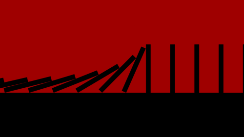
ember-stagger-swagger


GPU stagger animation for Ember list items
See the demo here.
Installation
ember install ember-stagger-swagger
Usage
ember-stagger-swagger ships with a stagger-set component that can be used directly in a template to wrap the items that you wish to animate.
Conceptually, the component treats all direct child elements as its set items or list items:
<h2>Spell Ingredients </h2> {{#stagger-set inDirection="right" inEffect="slideAndFade"}} {{#each potions as |potion|}} <li>{{potion.name}}</li> {{/each}} {{/stagger-set}} Additionally, ember-stagger-swagger exposes a mixin that can be imported directly from the addon and extended however you see fit:
import StaggerSetMixin from 'ember-stagger-swagger/mixins/stagger-set';API
inDirection
- description: The direction of animation when the items stagger into view.
- required: yes
- constraints: A string keyword matching either
'left','down','right', or'up'.
outDirection
- description: The direction of animation when the items stagger out of view.
- required: no
- default: The provided
inDirection. - constraints: A string keyword matching either
'left','down','right', or'up'.
inEffect
- description: A recognized animation effect applied to each list item when it's animating in.
- required: yes
- constraints: A string keyword matching either
'slideAndFade','slide','fade', or'scale'(see the demo for a preview of each).
outEffect
- description: A recognized animation effect applied to each list item when it's animating in.
- required: no
- default: the provided
inEffect - constraints: A string keyword matching either
'slideAndFade','slide','fade', or'scale'(see the demo for a preview of each).
customInEffect
- description: An animation name matching a CSS animation keyframe that you have defined in your project. If specified alongside an
inEffect, this name will take precedence. This can be used to create your own effects and integrate them withstagger-swagger's built-in functionality. - required: no
- default:
null - constraints: None. Just make sure the name matches a CSS animation keyframe that you have defined in your project.
customOutEffect
- description: An animation name matching a CSS animation keyframe that you have defined in your project. If specified alongside an
outEffect, this name will take precedence. This can be used to create your own effects and integrate them withstagger-swagger's built-in functionality. - required: no
- default:
null - constraints: None. Just make sure the name matches a CSS animation keyframe that you have defined in your project.
showItems
- description: Manual hook for toggling the set between its entrance and exit animations.
- required: no
- default:
trueto correspond withenterOnRender's default. - constraints:
trueorfalse
enterOnRender
- description: Whether or not the elements in the stagger set should animate into view when the component is rendered.
Note:enterOnRenderallows for a more fine-grained level of control than just usingshowItems. WithoutenterOnRender, initializing the component withshowItemsset totruewill cause the items to render in their normal visible state, from which the animation can be toggled further. SettingenterOnRenderto true -- in conjunction with settingshowItemsto true (both of which are the default) -- creates a stagger-in animation on render and then hinges on the state ofshowItemsgoing forward. - required: no
- default:
true - constraints:
trueorfalse
staggerInterval
- description: the number of milliseconds between the animation of successive items in the set.
- required: no
- default: 32ms. 2 frames per item (1 frame @ 60fps ~= 16ms) creates a noticeably staggered but still-perceptively smooth and fluid motion.
- constraints: a number value greater than or equal to 32.
inDelay
- description: Duration of delay for the items' entrance animation (when the animation is activated).
- required: no
- default: 0
- constraints: a number value greater than or equal to 0.
outDelay
- description: Duration of delay for the items' exit animation (when the animation is activated).
- required: no
- default: 0
- constraints: a number value greater than or equal to 0.
inTimingFunc
- description: The animation-timing-function applied to each item in the set when it's animating in.
- required: no
- default:
cubic-bezier(0.215, 0.610, 0.355, 1.000)(AKA "ease-out-cubic") - constraints: a string matching any valid CSS
timing-functionvalue. If this value is invalid, the browser will default to usingease.
outTimingFunc
- description: The animation-timing-function applied to each item in the set when it's animating out.
- required: no
- default:
cubic-bezier(0.55, 0.055, 0.675, 0.19)(AKA "ease-in-cubic") - constraints: a string matching any valid CSS
timing-functionvalue. If this value is invalid, the browser will default to usingease.
inDuration
- description: The duration (in milliseconds) that a single item will take when animating in.
- required: no
- default: 500
- constraints: a numeric value greater than 0
outDuration
- description: The duration (in milliseconds) that a single item will take when animating out.
- required: no
- default: 500
- constraints: a numeric value greater than 0
duration
- description: A convenience property to set a single duration on both the entrance and exit animations. If set alongside any
inDurationoroutDuration, this property will take precedence - required: no
- default: null (property is ignored if unset),
- constraints: a numeric value greater than zero
Practical Tips
Styling
Because the DOM elements of Ember components are, by default, <div>s, and because it handles setting an animationName property on the component's direct children, you can safely design, conceptualize, and style your child elements as you normally would for the list items of a relative container.
Furthermore, because the keyframes for the built-in effects of slide and slideAndFade define transforms to bring their element in or out of its container's visible bounds (e.g., transform: translate3d(-100, 0, 0) at the 100%-stop of a left slide), it may well be useful to restrict overflow on the top-level component's element so that the children disappear when they're outside of said bounds.
The stagger-set "list items" demo is an example of how this would appear.
Creating Animation Effects
By default, a stagger-list component will attempt to map the keywords provided for inEffect or outEffect to one of its built-in keyframes.
However, you're free to implement your own keyframes and have them called instead. Just define them in your stylesheets as you would normally, and then pass the keyframe name to a stagger-list as a string argument for either customInEffect or customOutEffect. When these attributes are defined, stagger-list will always set them on the animation-name property of its child elements' style definition at the appropriate time.
Action Hooks
-
onAnimationStart: called immediately after the first item in the set triggers itsanimationstartevent.- called with:
animationEvent: theanimationeventobject
- called with:
-
onAnimationComplete: called immediately after the last item in the set triggers itsanimationendevent.- called with:
animationEvent: theanimationeventobject
- called with:
Together, these hooks can provide more control over interactions with the component during its animation. For example, if you set up a button to trigger toggles of the animation, you might want to make sure that it's disabled between the start and completion events.
<h2>Spell Ingredients </h2> {{#stagger-set inDirection="right" inEffect="slideAndFade" onAnimationStart=(action 'loadCannons') onAnimationComplete=(action 'fireCannons')}} {{#each potions as |potion|}} <li>{{potion.name}}</li> {{/each}} {{/stagger-set}} Future Goals & Ideas
- Tentative: Explore improved effects for the vertical
slideanimation?- possibly break the mixins apart to deal with vertical and horizontal animation separately?
- Tentative: Removing need for any CSS by using the Web Animations API?
- Libraries like GSAP or Velocity are great for enabling pure JavaScript animation today (see:
liquid-fire-velocity), but they're a bit too heavy for this addon, which only seeks to provide a handful of base effects and mainly concerns itself with encapsulating functionality.
- Libraries like GSAP or Velocity are great for enabling pure JavaScript animation today (see:
Developing Locally
Installation
git clonethis repositorynpm installbower install
Running
ember server- Visit your app at http://localhost:4200.
Running Tests
npm test(Runsember try:testallto test your addon against multiple Ember versions)ember testember test --server
Building
ember build
For more information on using ember-cli, visit http://www.ember-cli.com/.